( Role )
branding
uiuX
.
MADE51
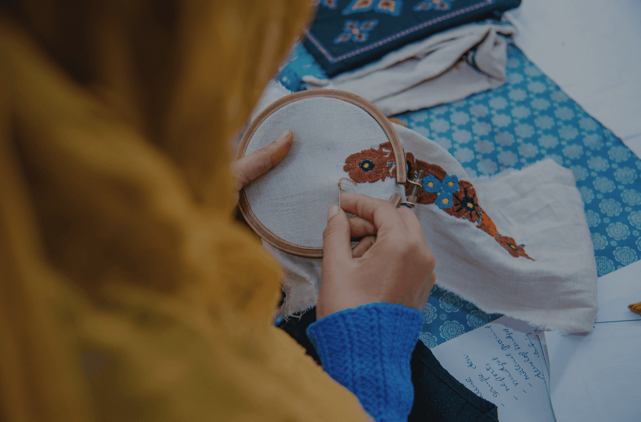
MADE51 is a UNHCR program that provides an arena for refugees to sell their handicrafts and earn their living.
.
( industry )
NGO
E-Commerce
( Role )
branding
uiuX
.
MADE51
MADE51 is a UNHCR program that provides an arena for refugees to sell their handicrafts and earn their living.
.
( industry )
NGO
E-Commerce
( Role )
branding
uiuX
.
MADE51
MADE51 is a UNHCR program that provides an arena for refugees to sell their handicrafts and earn their living.
.
( industry )
NGO
E-Commerce
( Role )
branding
uiuX
.
MADE51
MADE51 is a UNHCR program that provides
an arena for refugees to sell their handicrafts
and earn their living.
.
( industry )
NGO
E-Commerce
MADE51
UNHCR program
UNHCR program
(introduction)
(introduction)
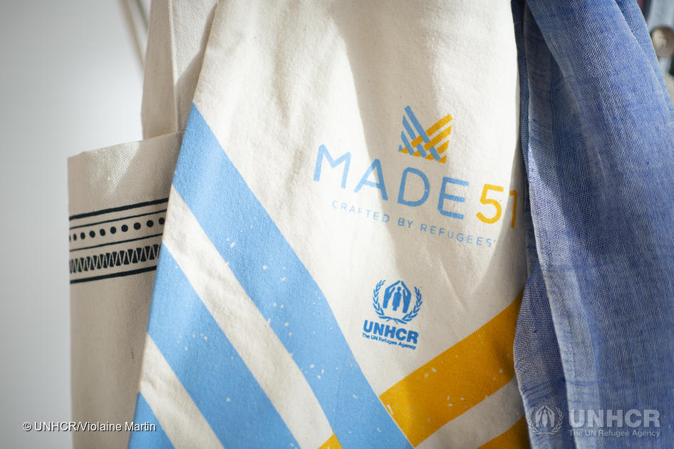
MADE51 is a UNHCR program that provides an arena for refugees to sell their handicrafts, which help them earn a living, establish independence and improve their livelihoods.
MADE51 is a UNHCR program that provides an arena for refugees to sell their handicrafts, which help them earn a living, establish independence and improve their livelihoods.
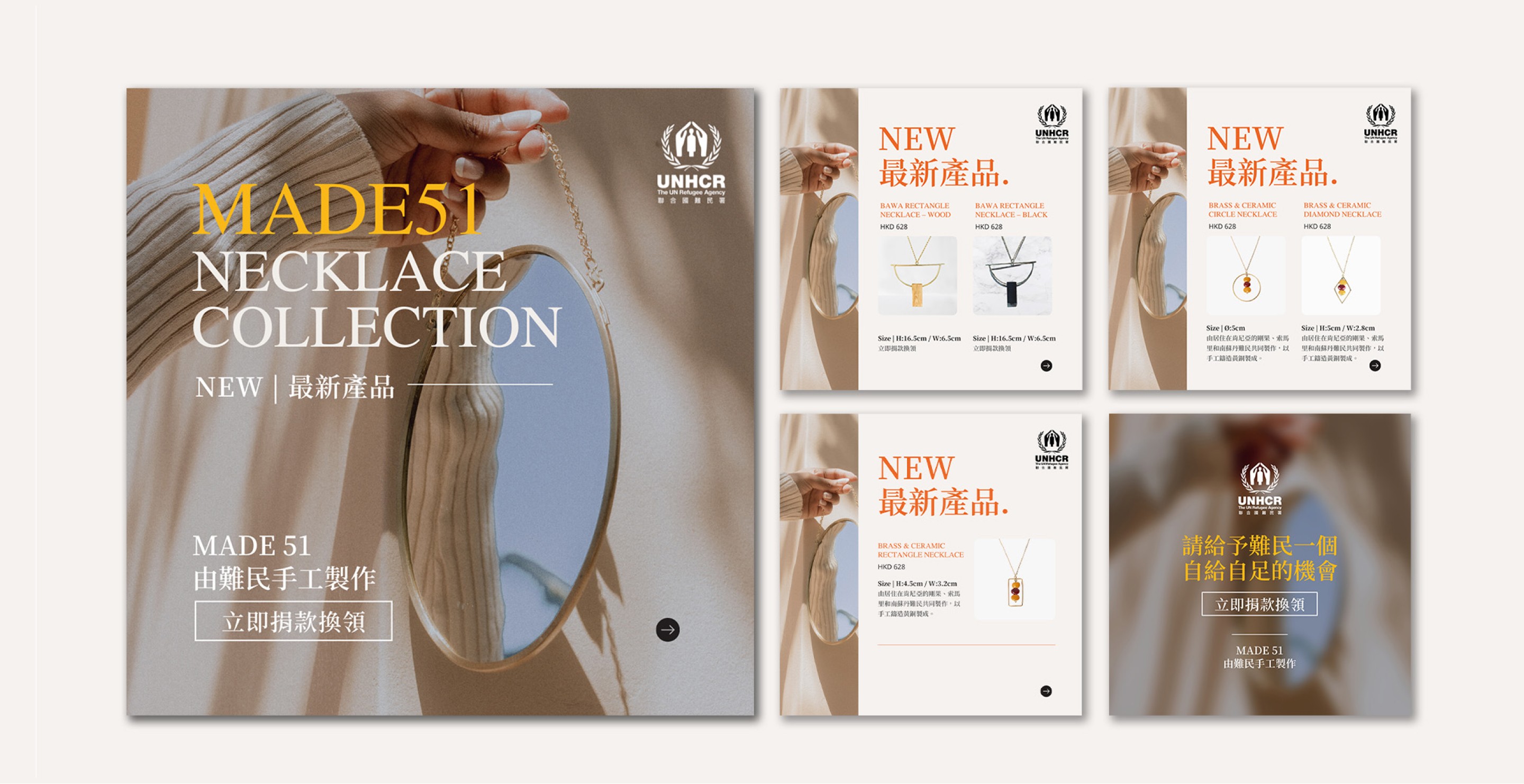
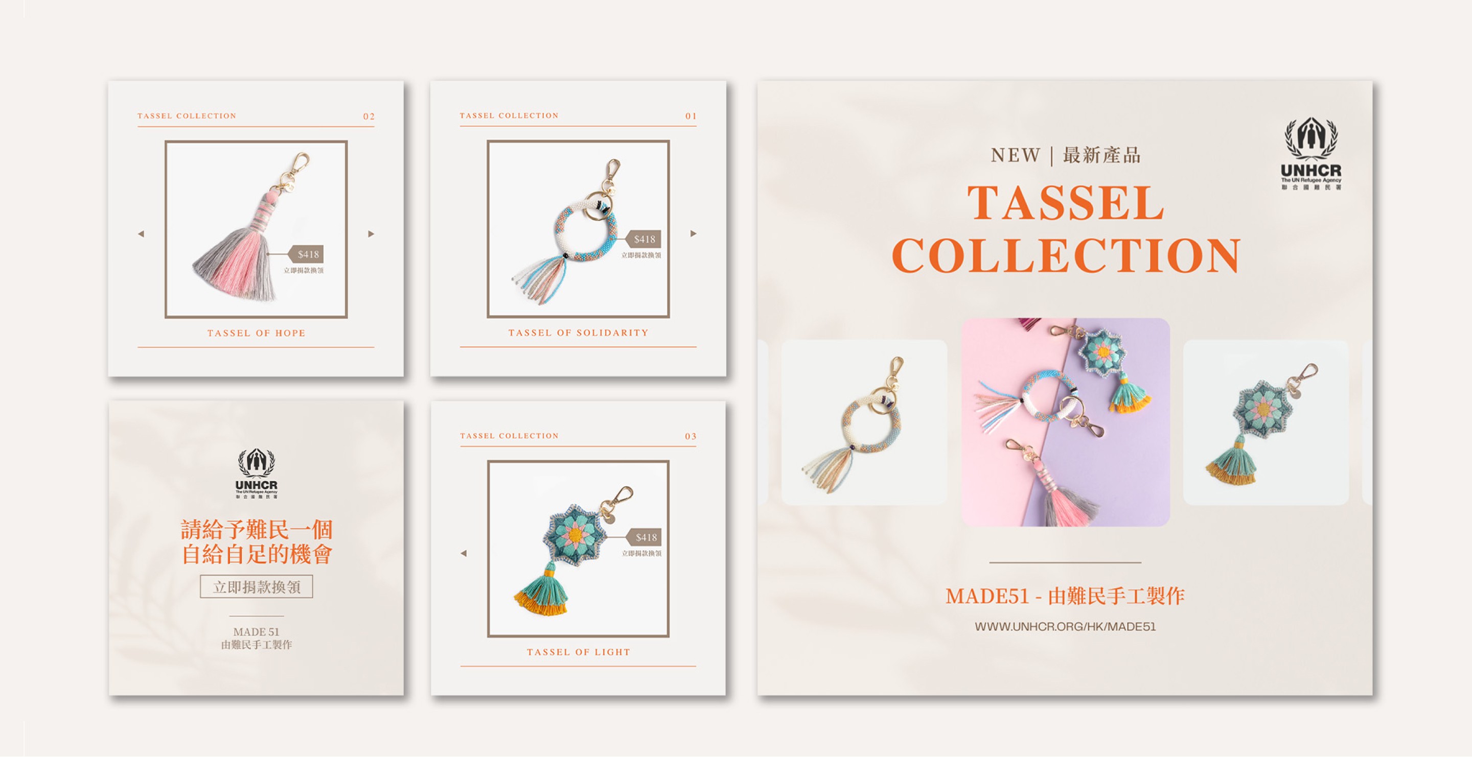
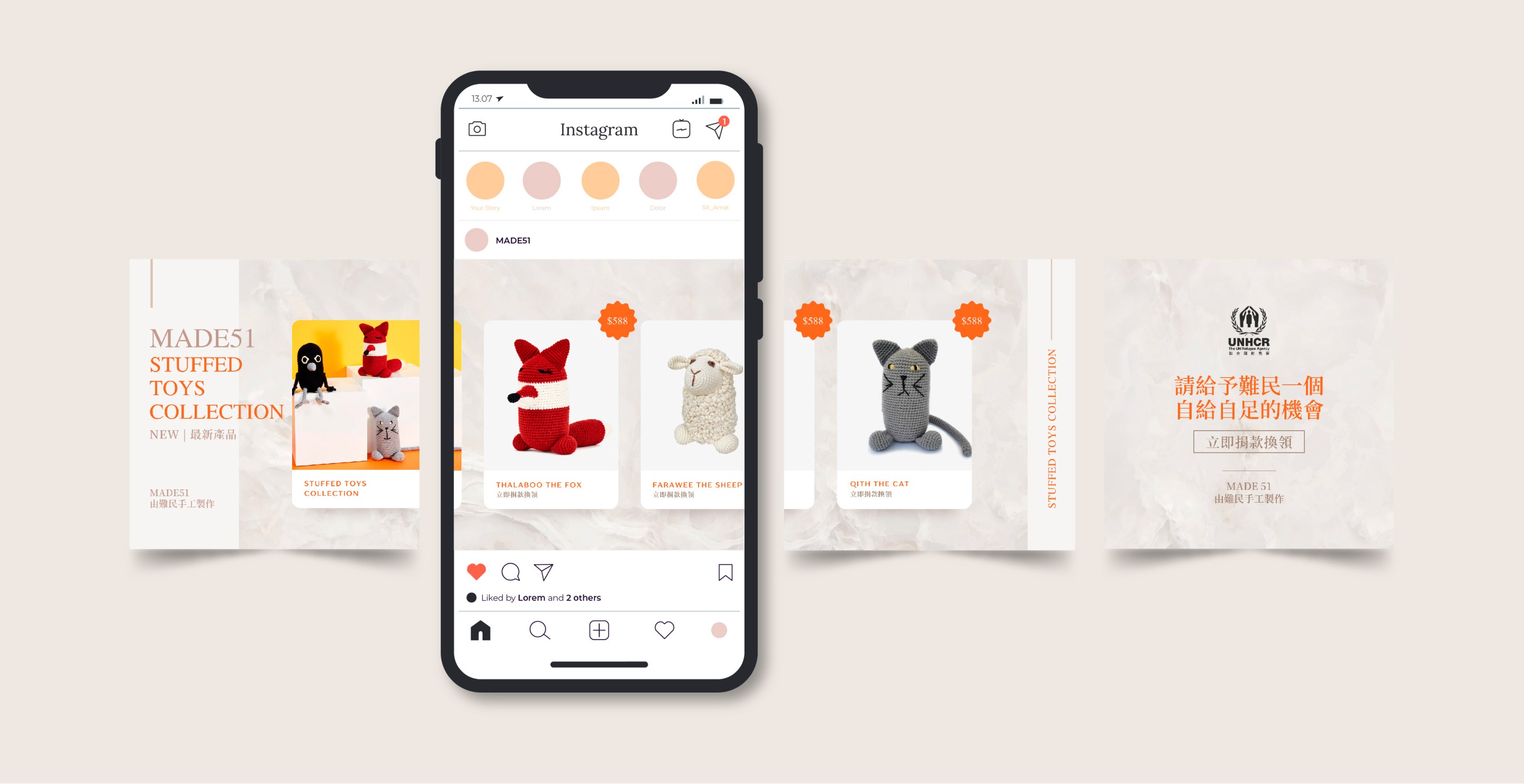
During the internship at UNHCR, I am responsible for this project rebranding, including website redesign, social media feed design, content creation and preparing promotional videos. Upon the discussion with the team manager, MADE51 aims to rebrand as a high-end brand and turn into an e-commerce style so can drive more traffics and sells.
During the internship at UNHCR, I am responsible for this project rebranding, including website redesign, social media feed design, content creation and preparing promotional videos. Upon the discussion with the team manager, MADE51 aims to rebrand as a high-end brand and turn into an e-commerce style so can drive more traffics and sells.

(discover)
(discover)
We started by discovering the problems and pain points of the users faced when using the old website.
We started by discovering the problems and pain points of the users faced when using the old website.
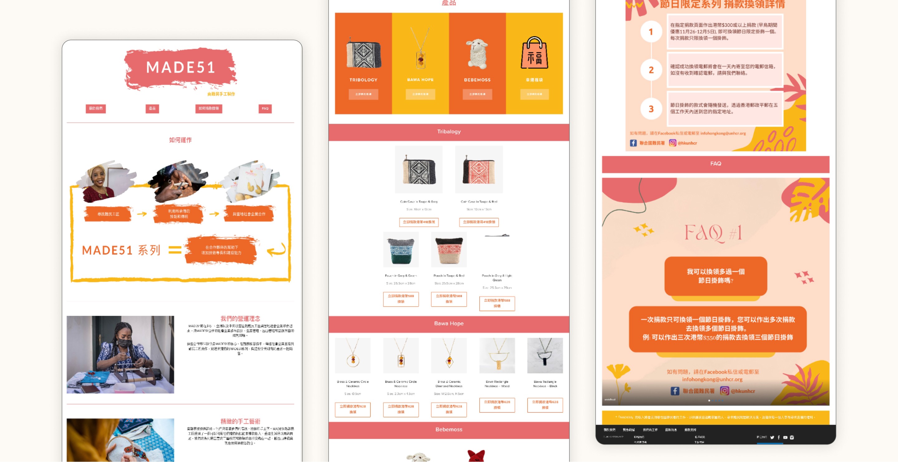


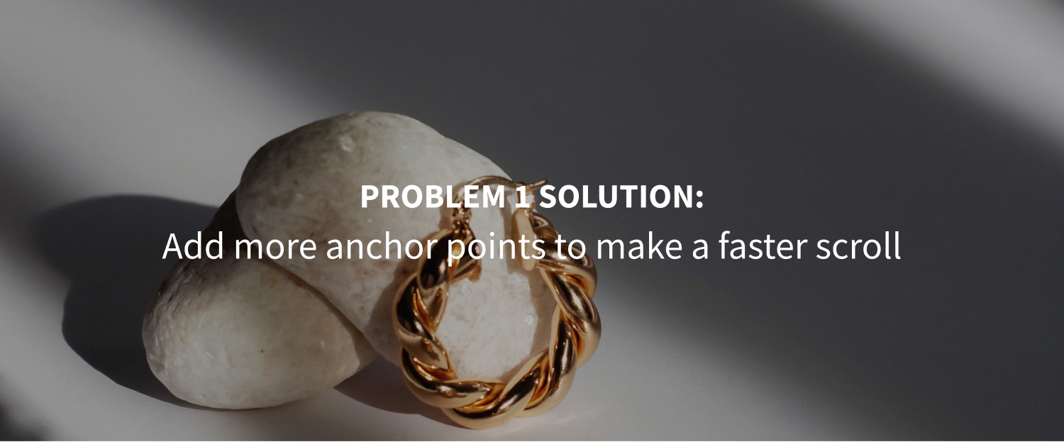
/ Problem 1
All the content is packed on a lengthy page. User needs to take a long time to scroll and search, which decrease their purchase desire.
/ Problem 1
All the content is packed on a lengthy page. User needs to take a long time to scroll and search, which decrease their purchase desire.
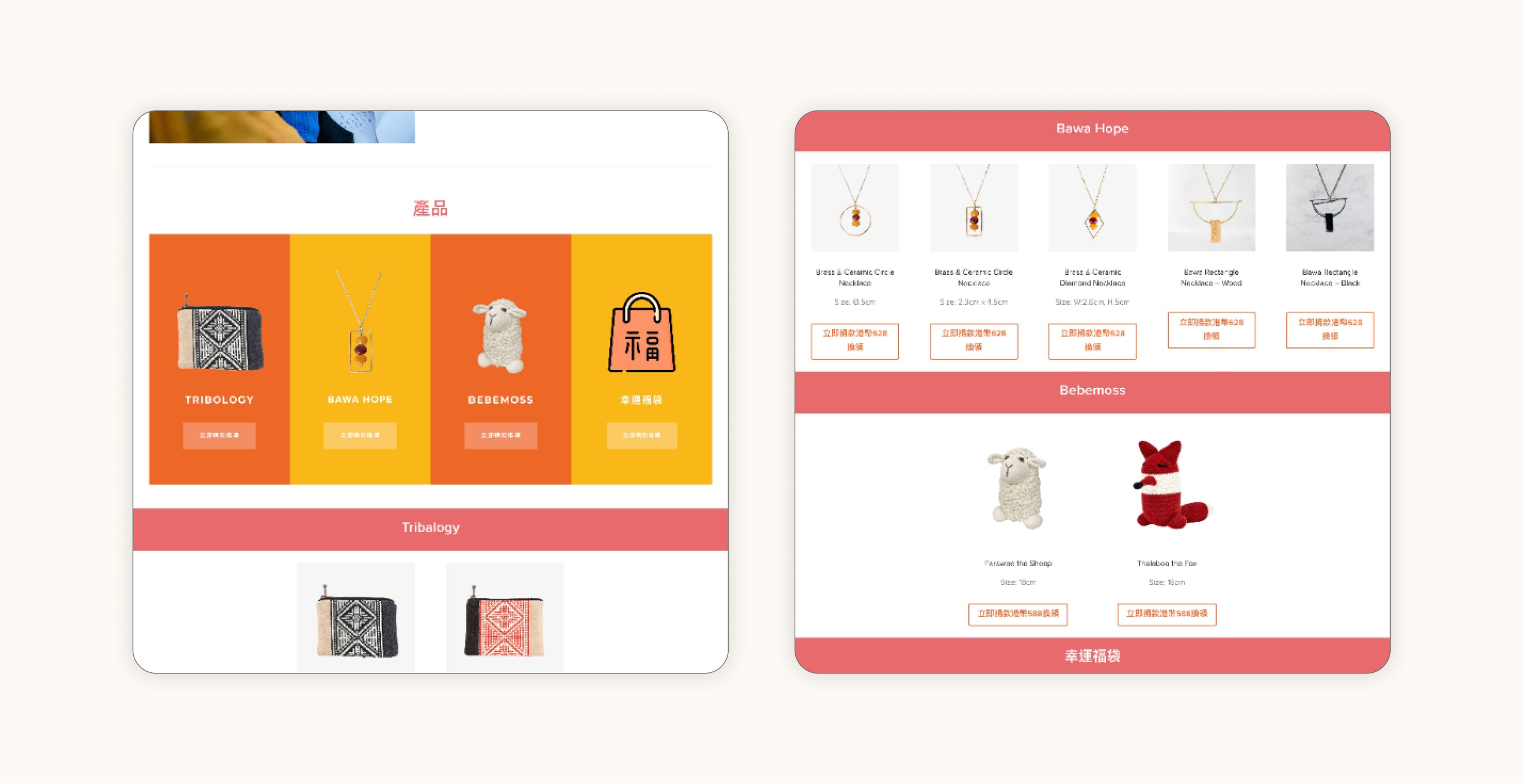


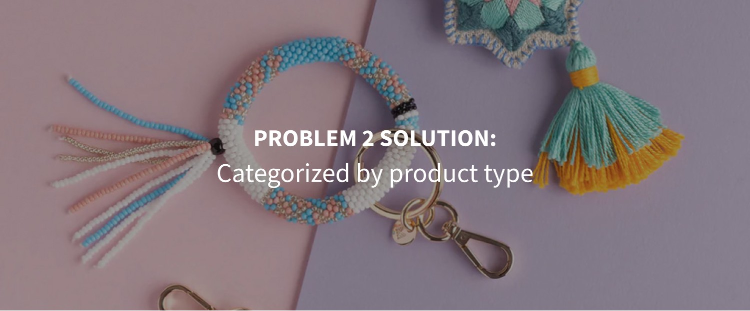
/ Problem 2
The page has a poor categorization of the product. They were categorized by cooperatives but it creates confusion, for example, necklaces and stuffed toys are in the same category, which makes it difficult when finding products.
/ Problem 2
The page has a poor categorization of the product. They were categorized by cooperatives but it creates confusion, for example, necklaces and stuffed toys are in the same category, which makes it difficult when finding products.
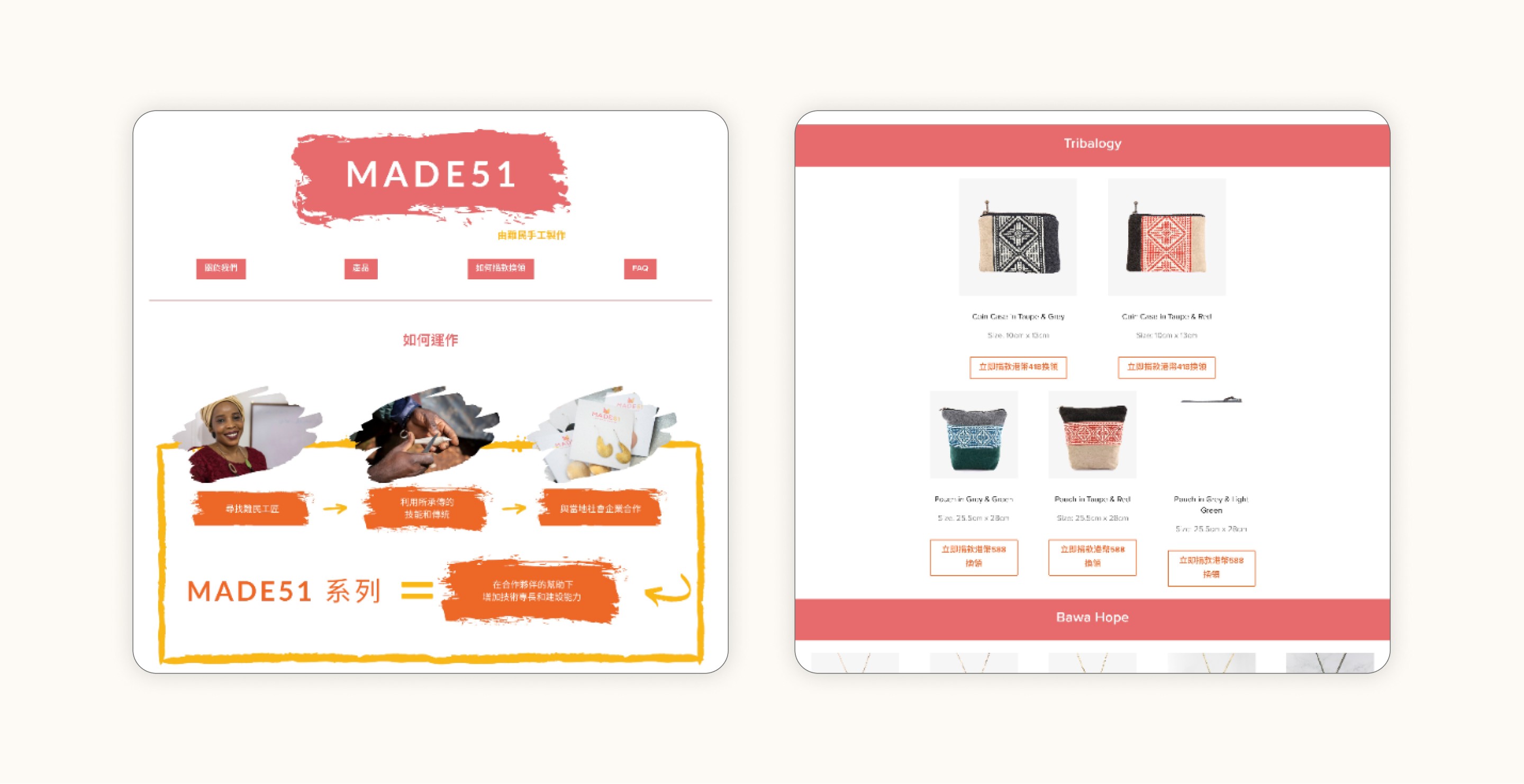


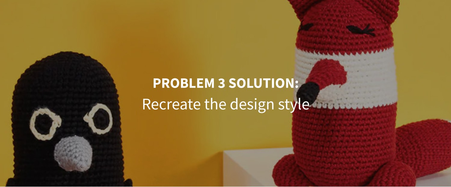
/ Problem 3
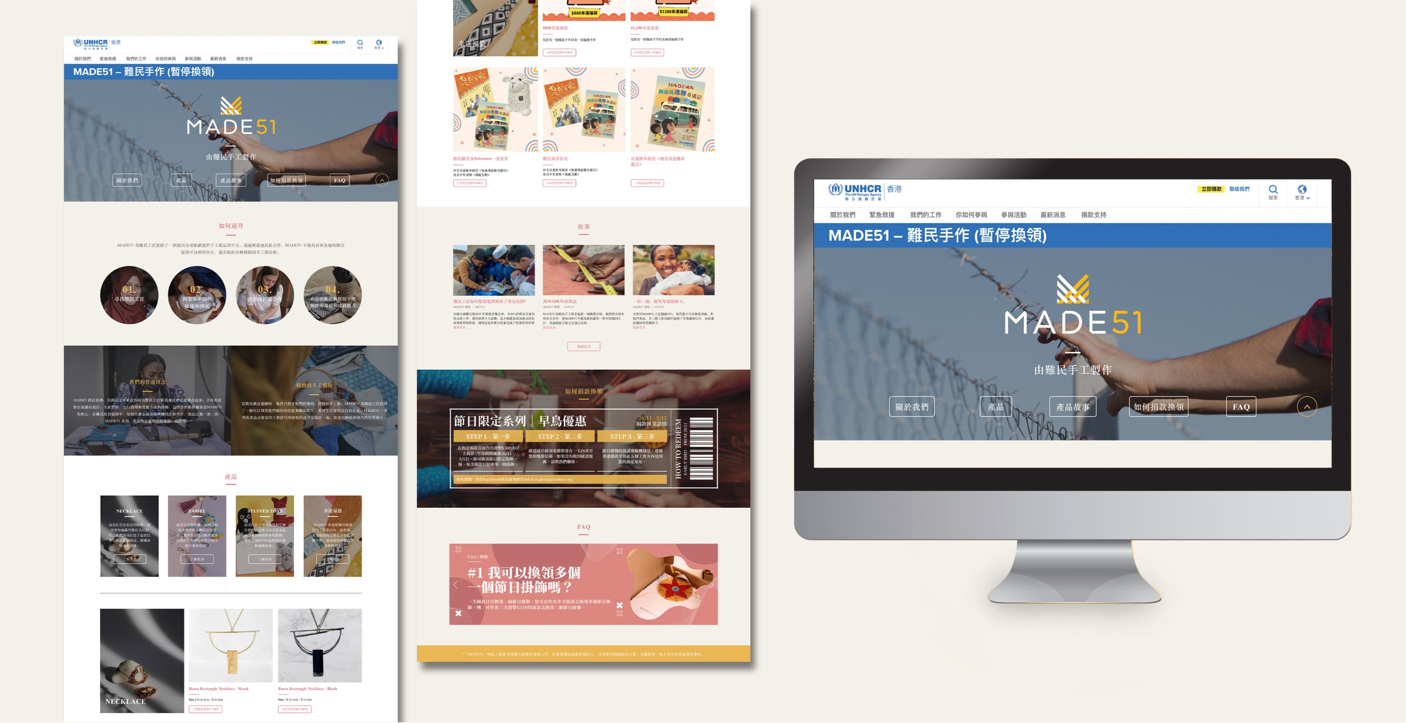
The visuals and layout are not attractive to draw user attention. Since it aims to rebrand as a high-end brand, the design style should be aesthetic and minimal.
/ Problem 3
The visuals and layout are not attractive to draw user attention. Since it aims to rebrand as a high-end brand, the design style should be aesthetic and minimal.
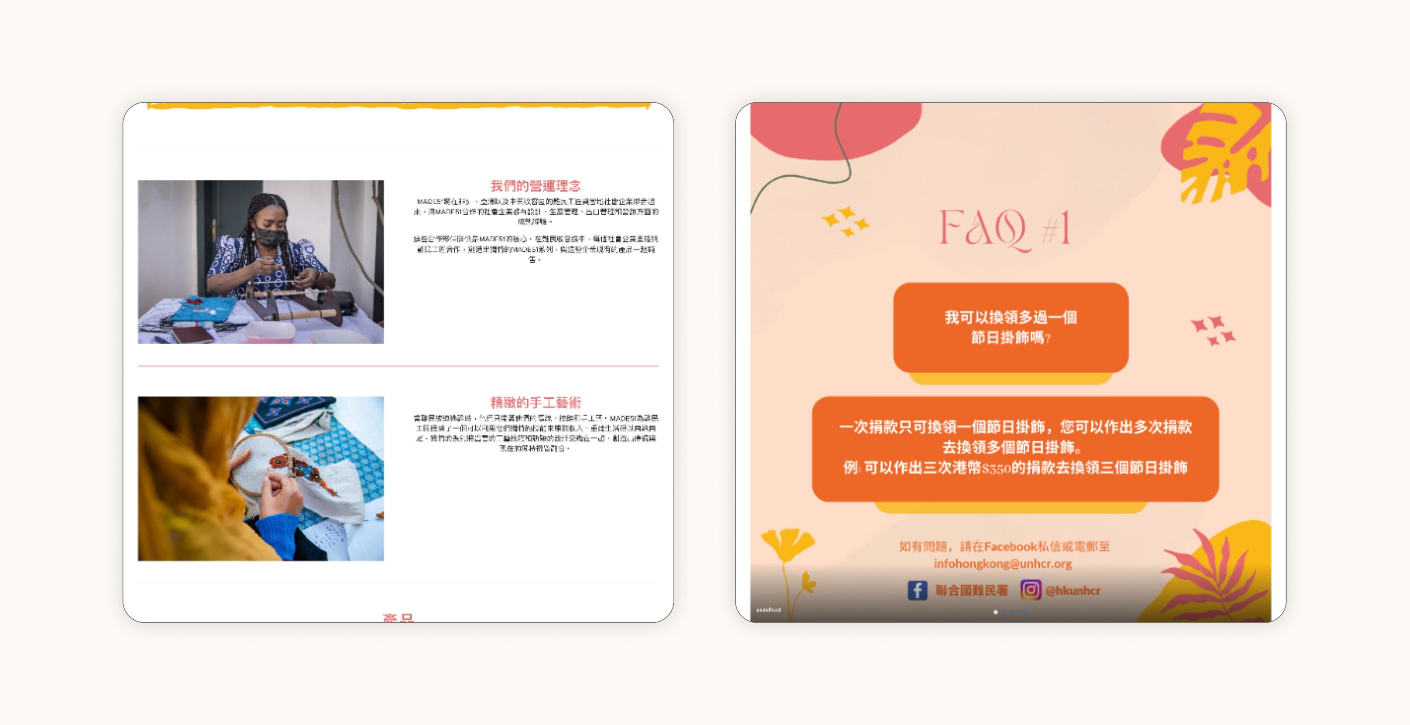


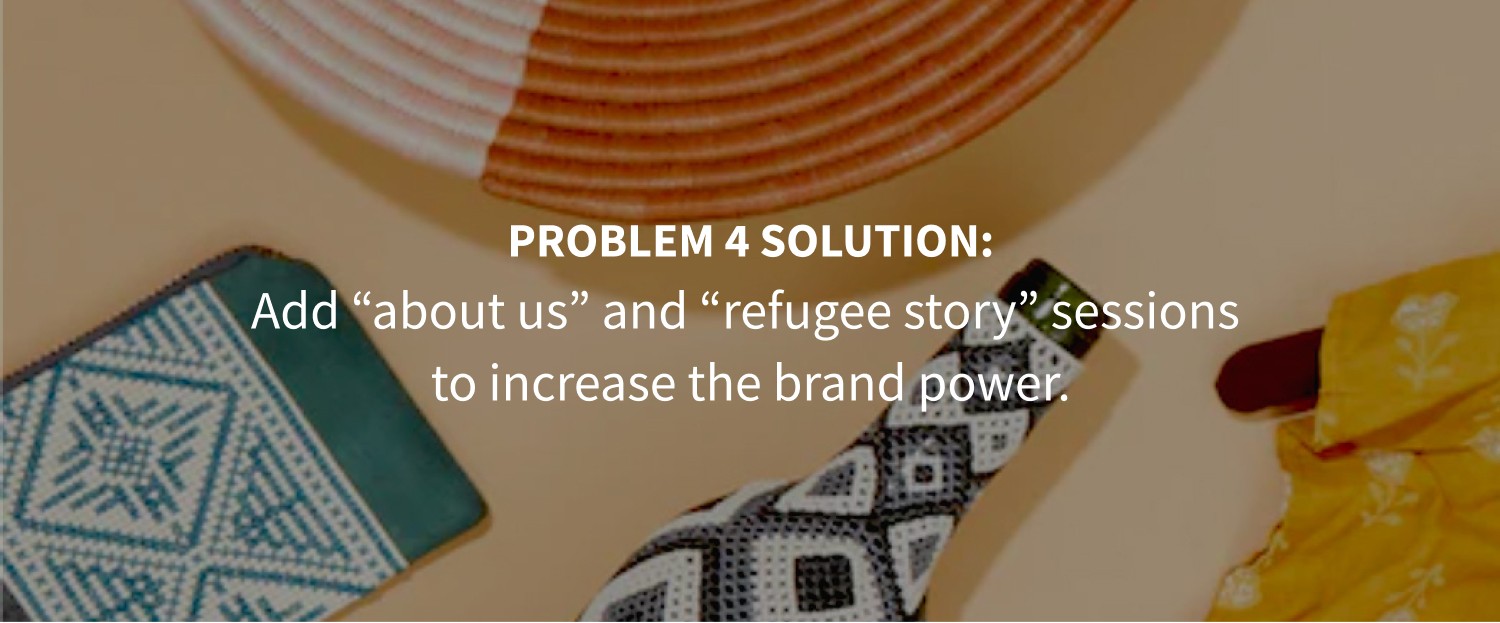
/ Problem 4
The page shows weak brand power. Refugee-handmade is a unique selling proposition that appeals to customers. Besides, how will MADE51 help the refugee is also another concerning point when purchasing the products.
/ Problem 4
The page shows weak brand power. Refugee-handmade is a unique selling proposition that appeals to customers. Besides, how will MADE51 help the refugee is also another concerning point when purchasing the products.
(goal)
(goal)
After understanding the problems that the users may faced, we set up our goals and solutions.
After understanding the problems that the users may faced, we set up our goals and solutions.








(design process)
(design process)
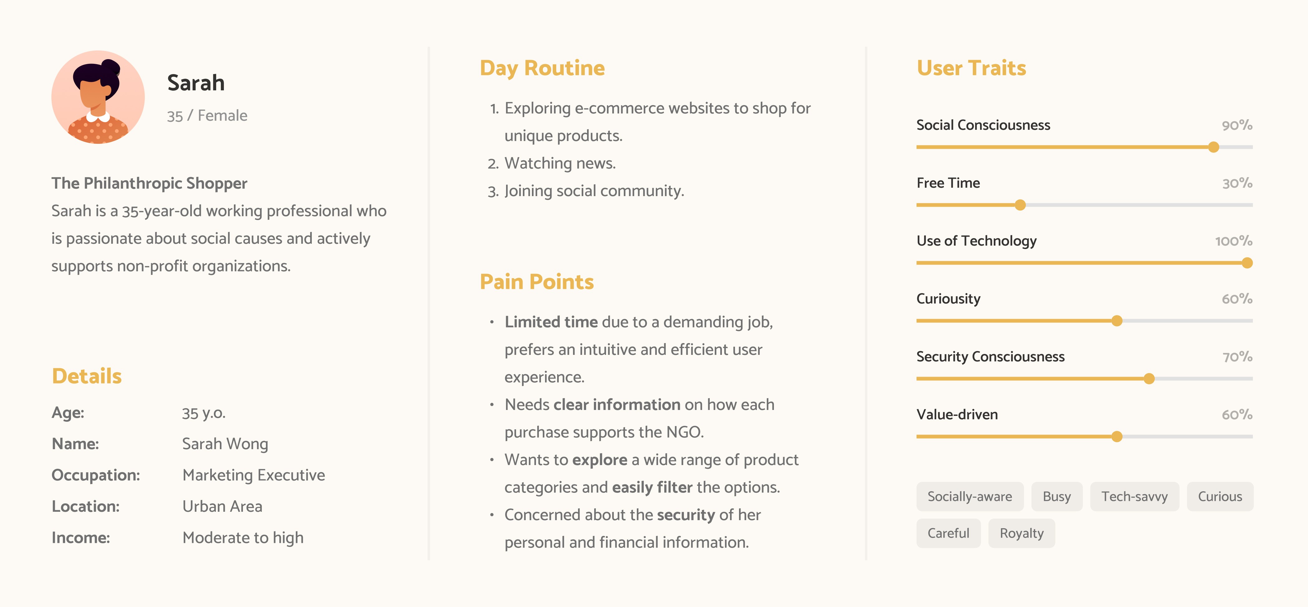
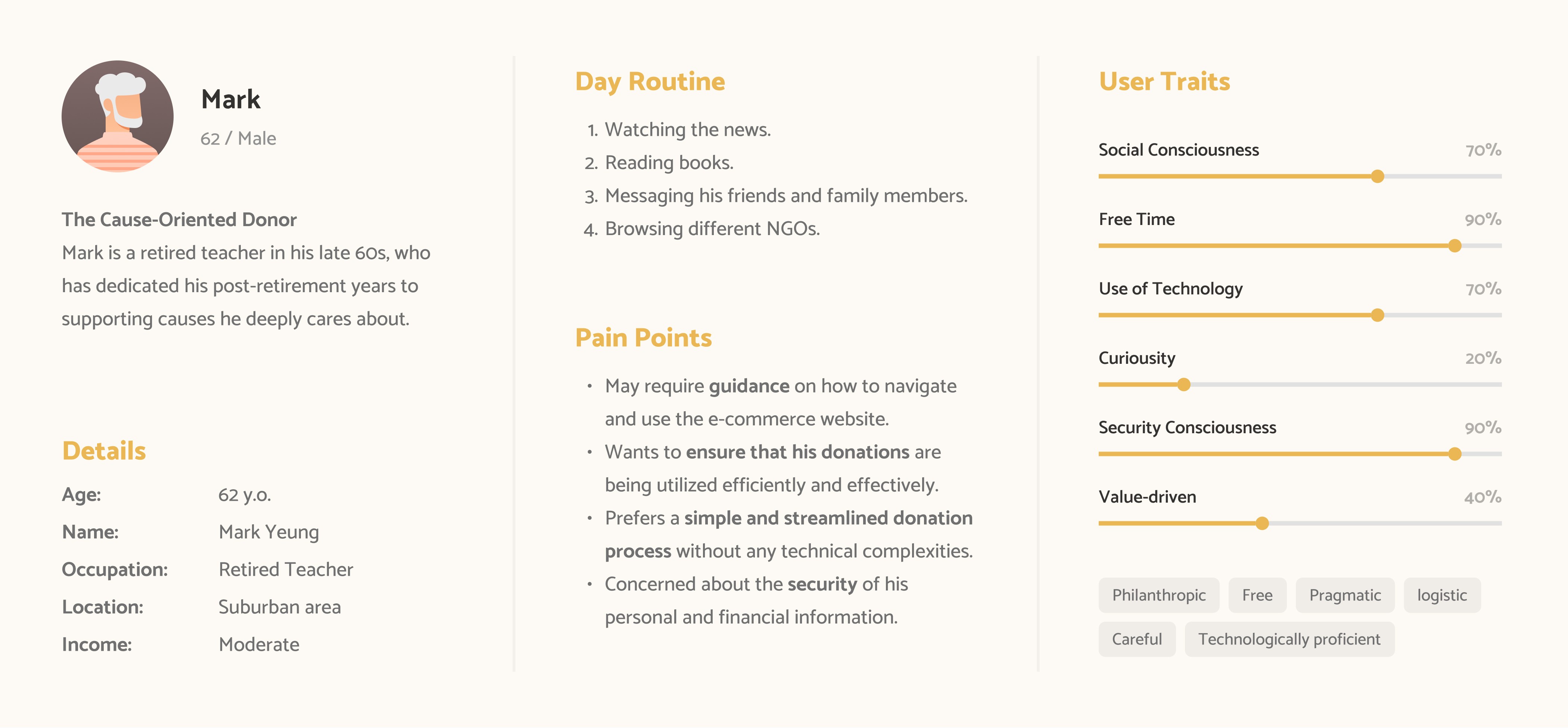
With all the goals in our mind, we kick off the design by mapping out the user persona.
With all the goals in our mind, we kick off the design by mapping out the user persona.




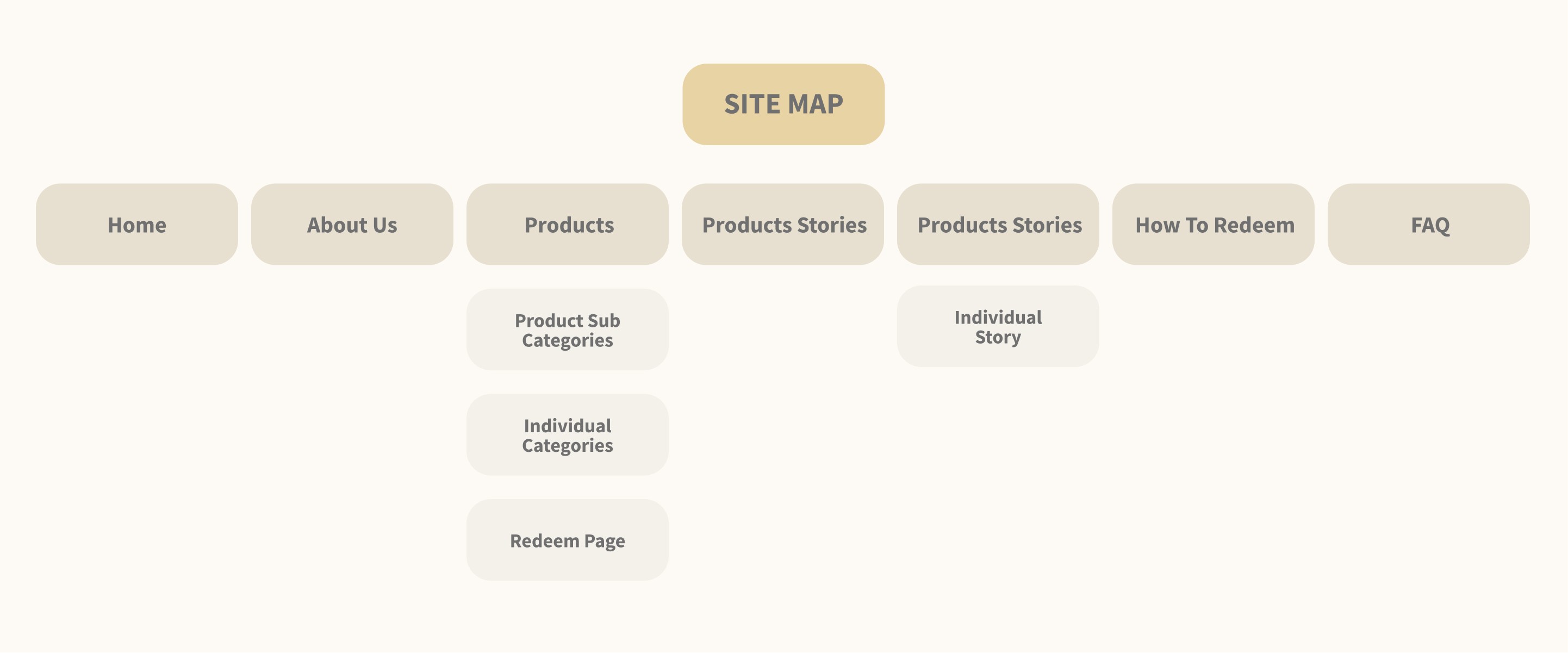
We then start creating site map and early wireframes.
We then start creating site map and early wireframes.
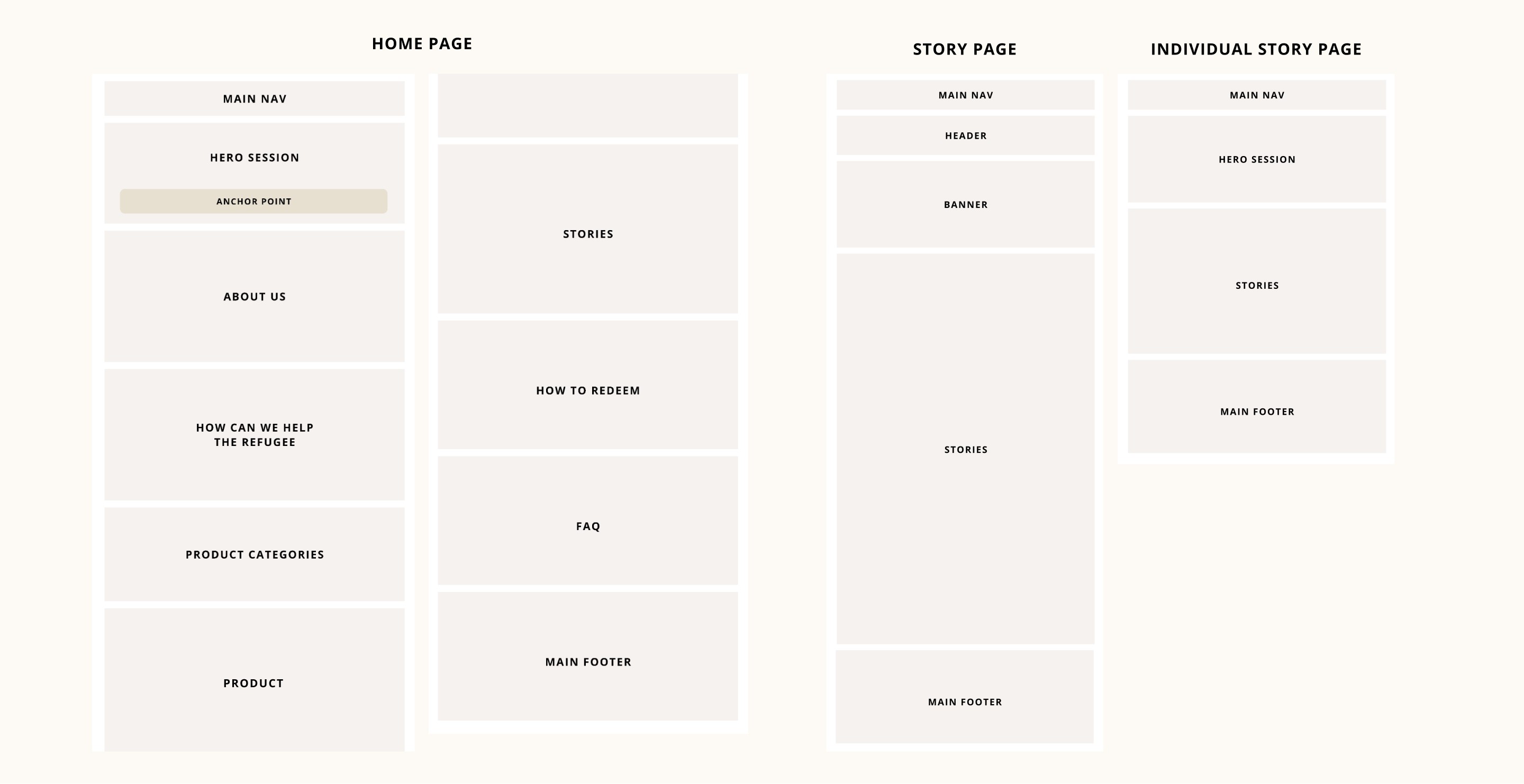
We mapped out the purpose on each section in the wireframe for us to know how will the users interact from section to section, from page to page.
We mapped out the purpose on each section in the wireframe for us to know how will the users interact from section to section, from page to page.




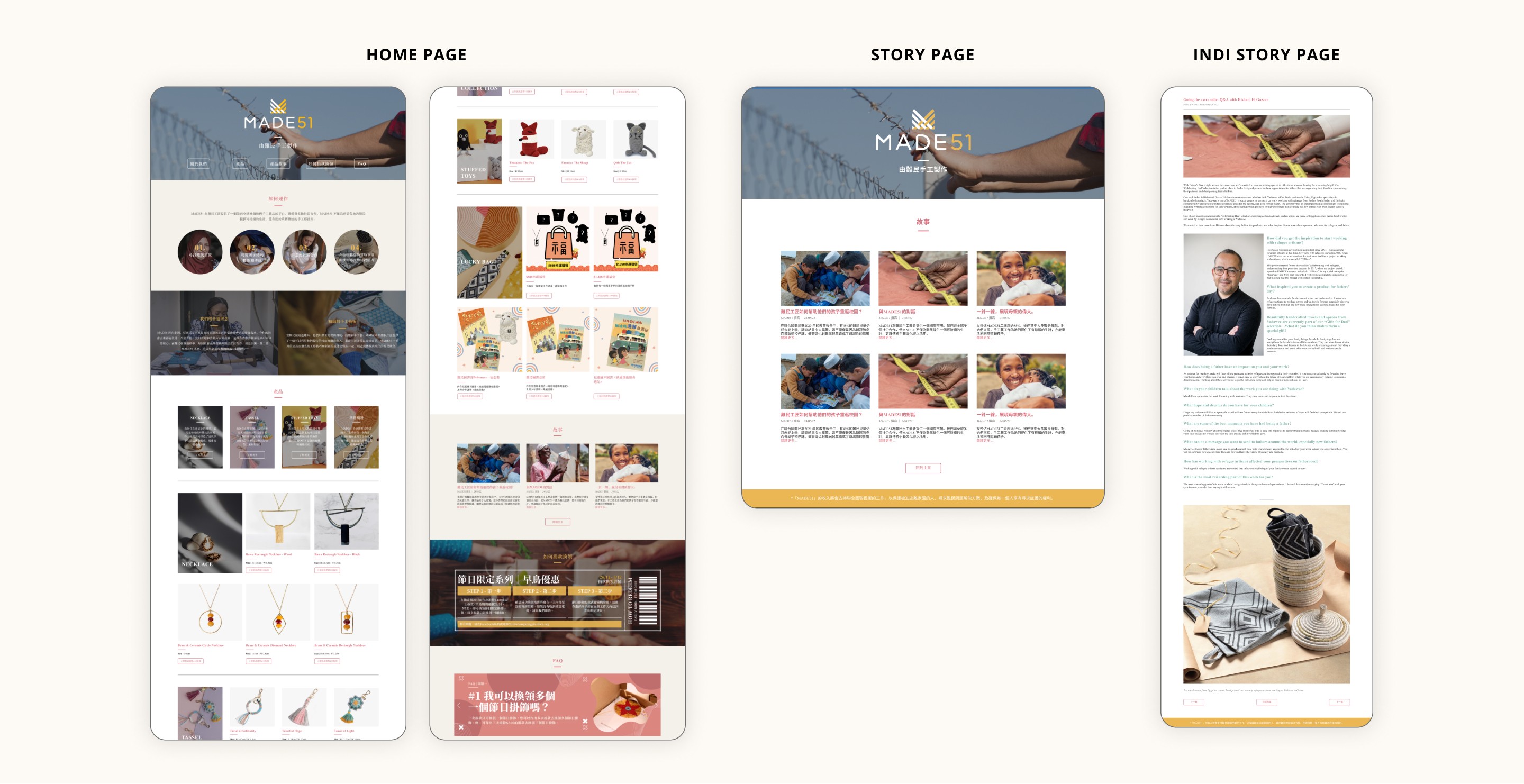
We turns these early wireframes into a high fidelity design and map out the design system.
We turns these early wireframes into a high fidelity design and map out the design system.
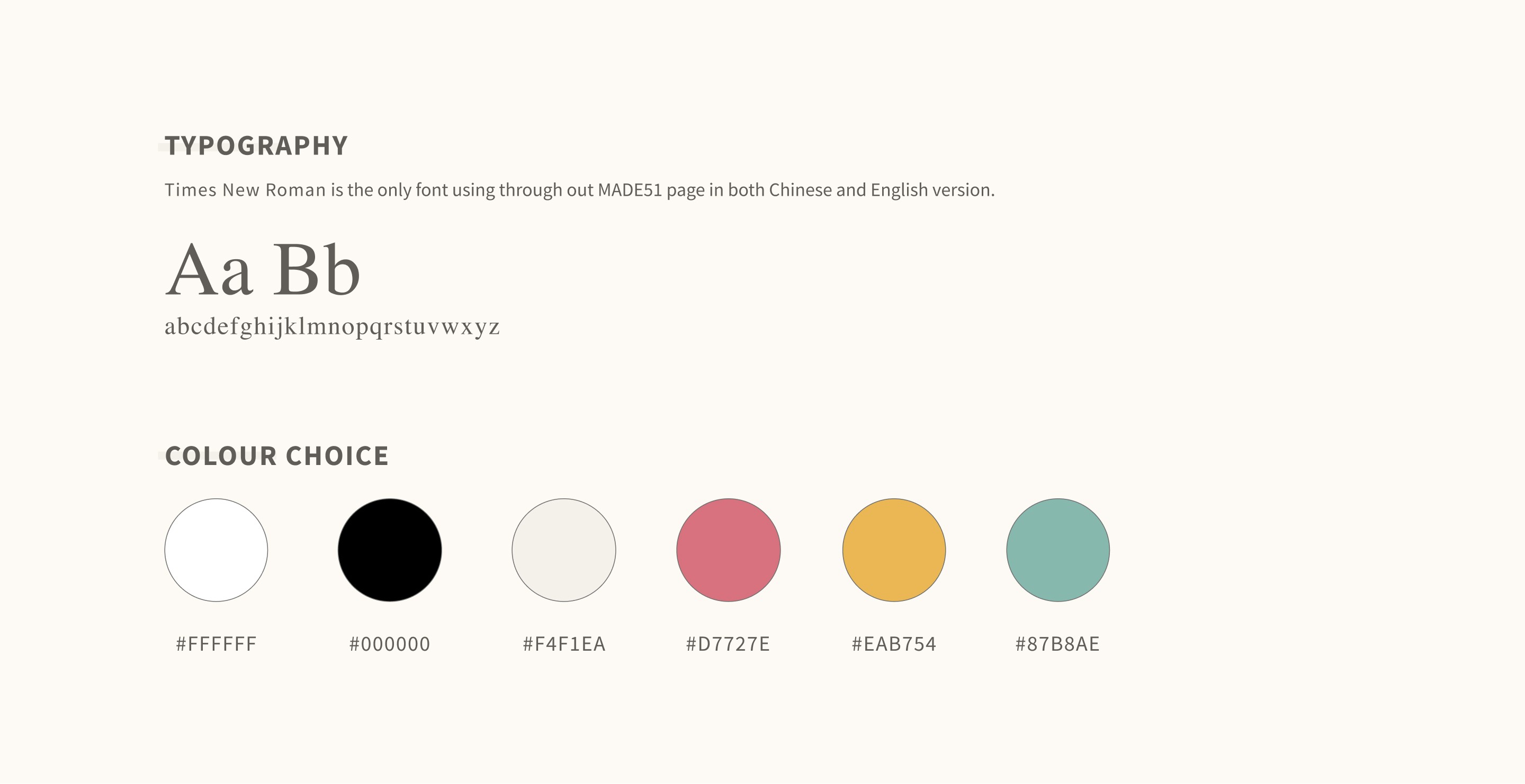
We have tested and experienced with different colour and font, and also the shape and the entire layout.
We have tested and experienced with different colour and font, and also the shape and the entire layout.




(result)
(result)
Here comes to the final design and other branding materials!
Here comes to the final design and other branding materials!








(impact & future)
(impact & future)
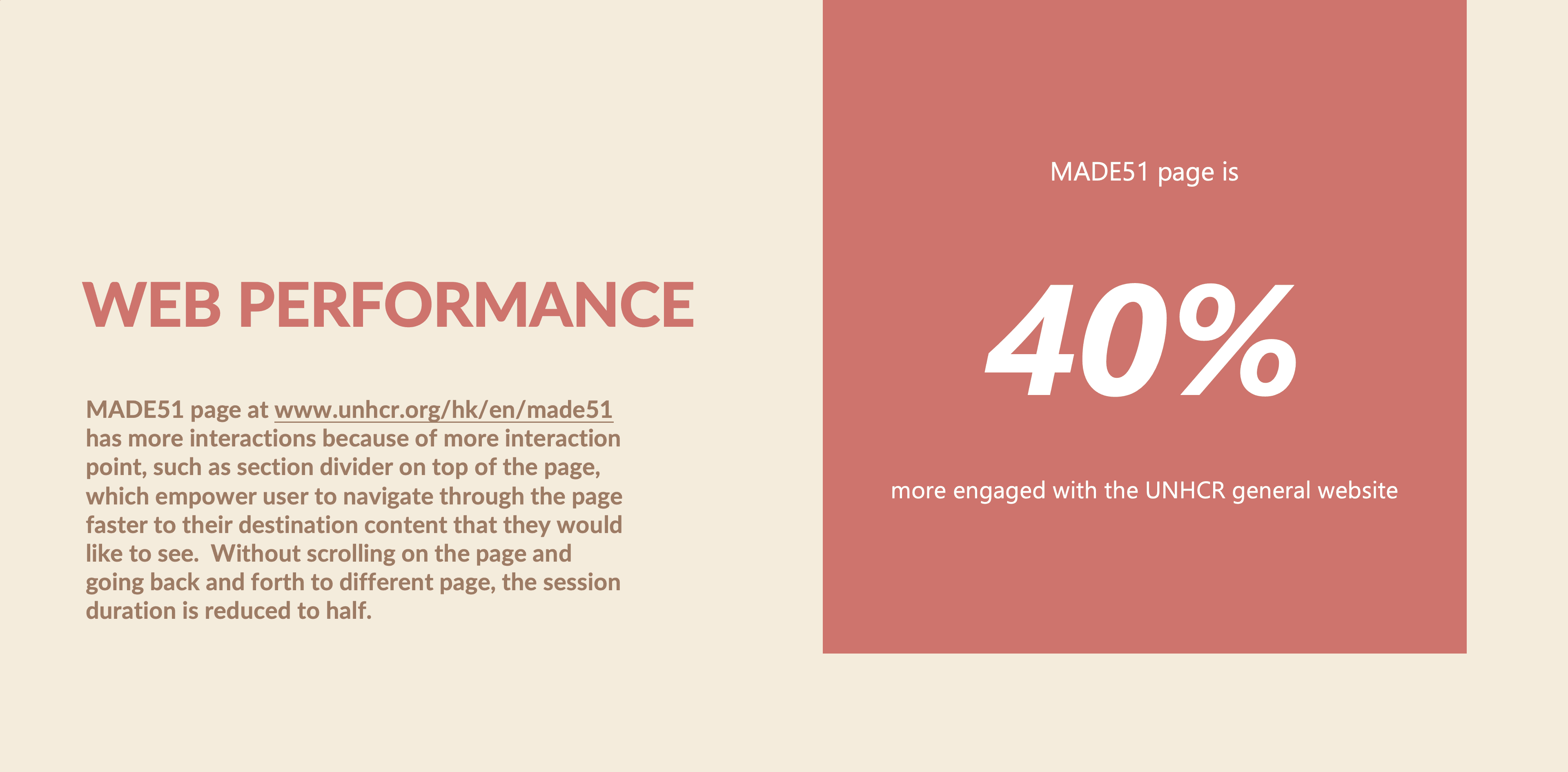
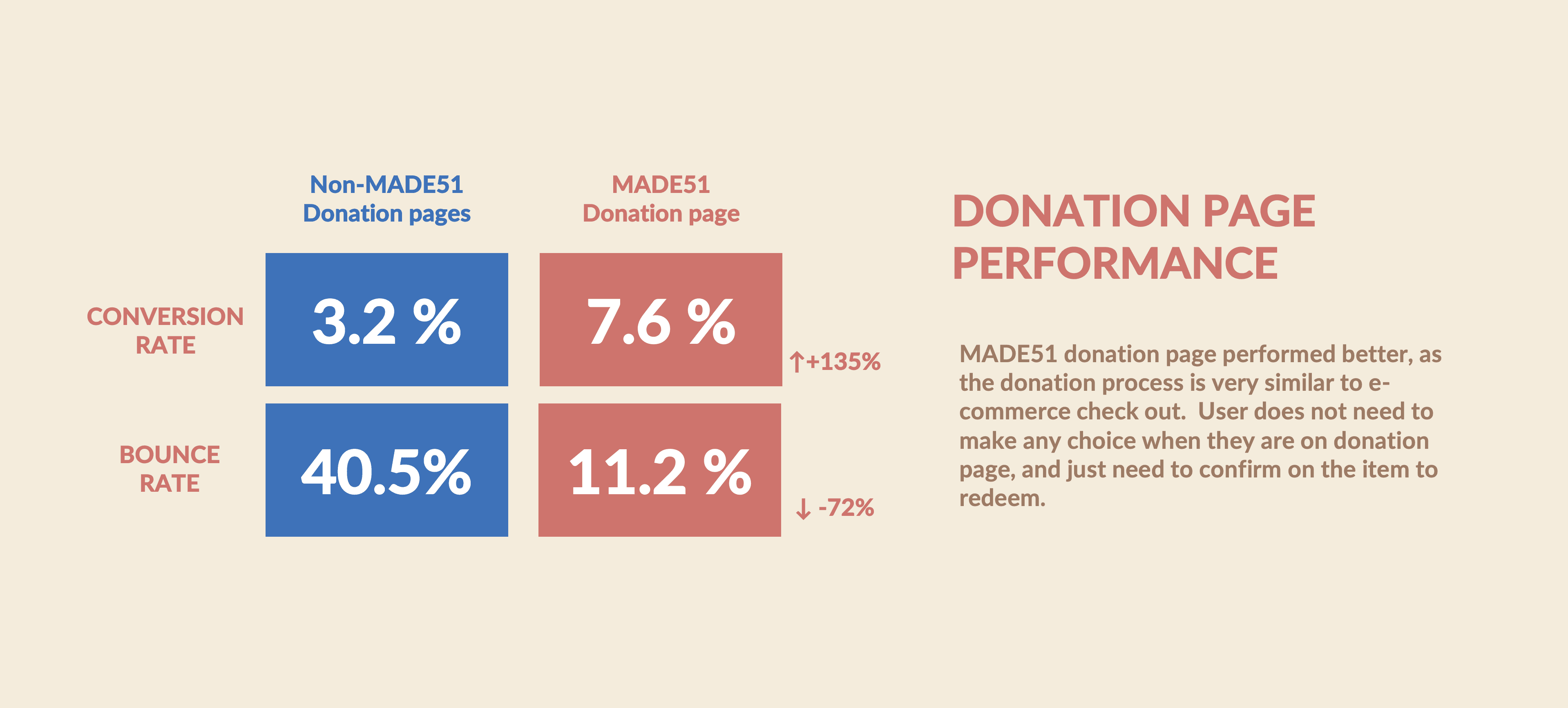
The redesign helped to drive more traffic and shows a significant increase in the number of donation.
The redesign helped to drive more traffic and shows a significant increase in the number of donation.




Reflection and improvement
Reflection and improvement
As the number of products increases, we may need to reconsider how the product will be categorized. The mobile version page will become more lengthy, and modification is needed to increase its usability.
As the number of products increases, we may need to reconsider how the product will be categorized. The mobile version page will become more lengthy, and modification is needed to increase its usability.