( Role )
UIUX designer
.
852Web3
852Web3 is the largest Web3 community in Hong Kong. We aim to promote the development of Web3 in Hong Kong.
.
( industry )
web3
( Role )
UIUX designer
.
852Web3
852Web3 is the largest Web3 community in Hong Kong. We aim to promote the development of Web3 in Hong Kong.
.
( industry )
web3
( Role )
UIUX designer
.
852Web3
MADE51 is a UNHCR program that provides
an arena for refugees to sell their handicrafts
and earn their living.
.
( industry )
web3
( Role )
UIUX designer
.
852Web3
852Web3 is the largest Web3 community in Hong Kong. We aim to promote the development of Web3 in Hong Kong.
.
( industry )
web3
852Web3
web3 community
web3 community
(introduction)
(introduction)
852Web3 is the largest Web3 community in Hong Kong. We organize gatherings, sharing, lectures and activities to promote the development of Web3 in Hong Kong.
852Web3 is the largest Web3 community in Hong Kong. We organize gatherings, sharing, lectures and activities to promote the development of Web3 in Hong Kong.
With the growth of the community, we need a website to showcase our event and set up a web3 ticketing method. The initial website was launched in March as Stage One and the home page has been revamped on June as Stage Two due to rebrand.
With the growth of the community, we need a website to showcase our event and set up a web3 ticketing method. The initial website was launched in March as Stage One and the home page has been revamped on June as Stage Two due to rebrand.

Stage One
March 2023
March 2023
(discover)
We started by discovering the problems and pain points of the user when using traditional ticketing.
We started by discovering the problems and pain points of the user when using traditional ticketing.







(goal)
(goal)
After understanding the problems that the users may faced, we set up our goals and solutions.
After understanding the problems that the users may faced, we set up our goals and solutions.




(design process)
(design process)
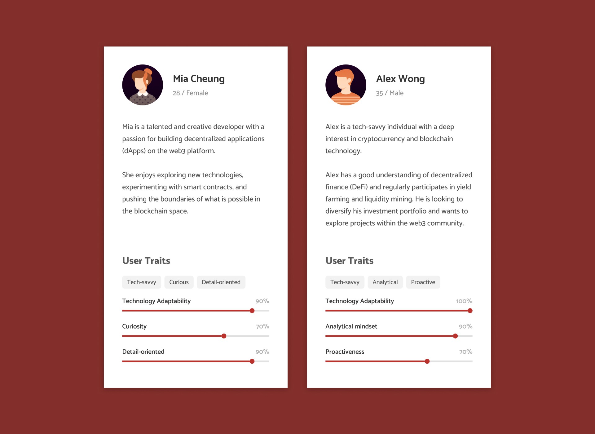
With all the goals in our mind, we kick off the design by mapping out the user persona.
With all the goals in our mind, we kick off the design by mapping out the user persona.


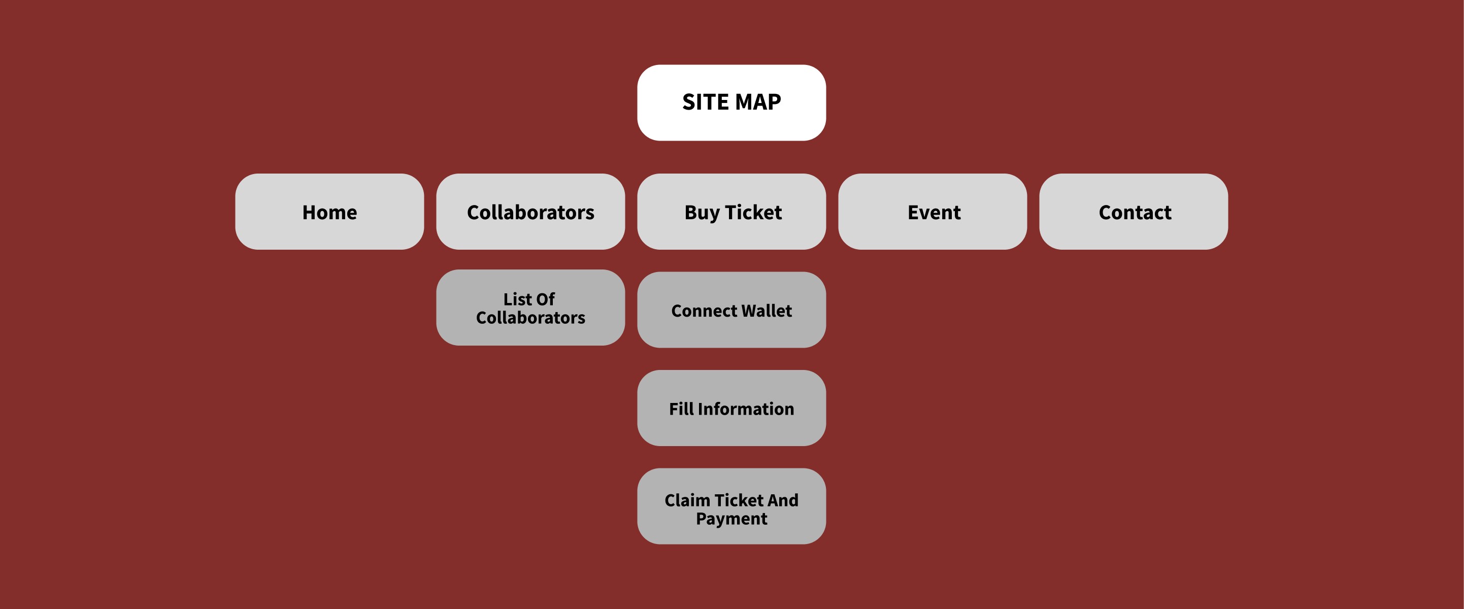
We then start creating site map and early wireframes.
We then start creating site map and early wireframes.
We mapped out the purpose on each section in the wireframe for us to know how will the users interact from section to section, from page to page.
We mapped out the purpose on each section in the wireframe for us to know how will the users interact from section to section, from page to page.


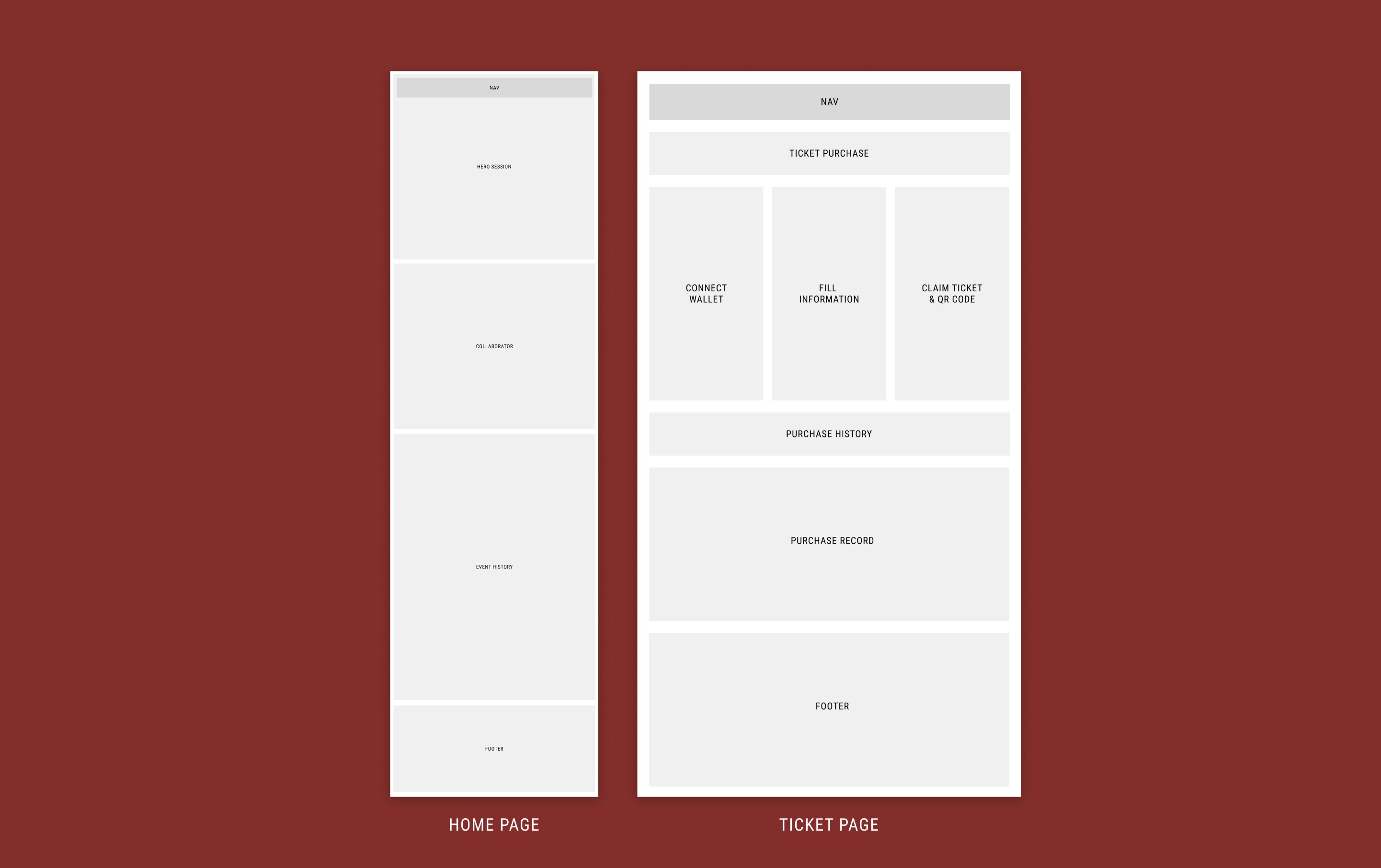


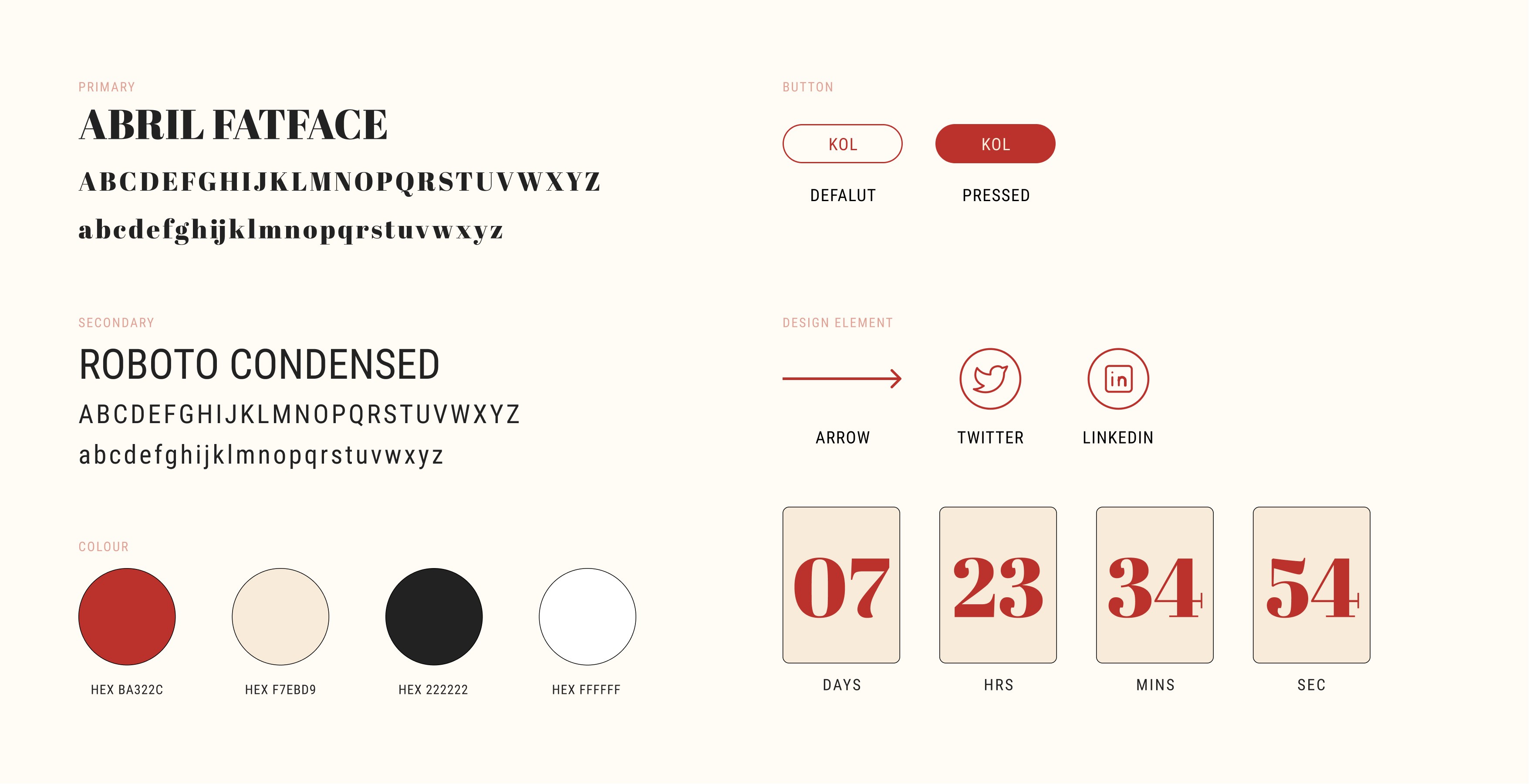
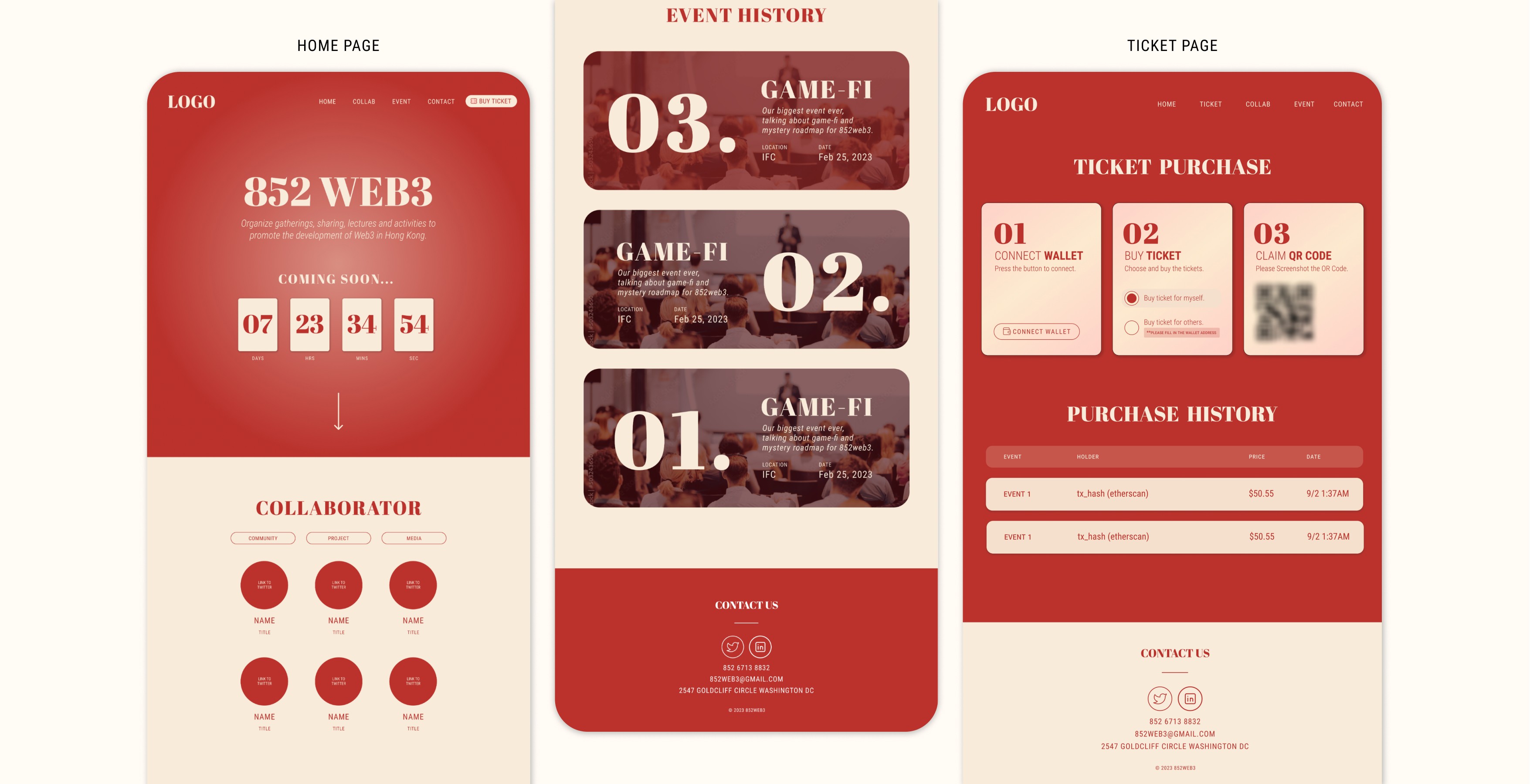
We turns these early wireframes into a high fidelity design and map out the design system.
We turns these early wireframes into a high fidelity design and map out the design system.
We have tested and experienced with different colour and font, and also the shape and the entire layout.
We have tested and experienced with different colour and font, and also the shape and the entire layout.




(testing)
(testing)
The website has undergone testing after the first launch.
The website has undergone testing after the first launch.
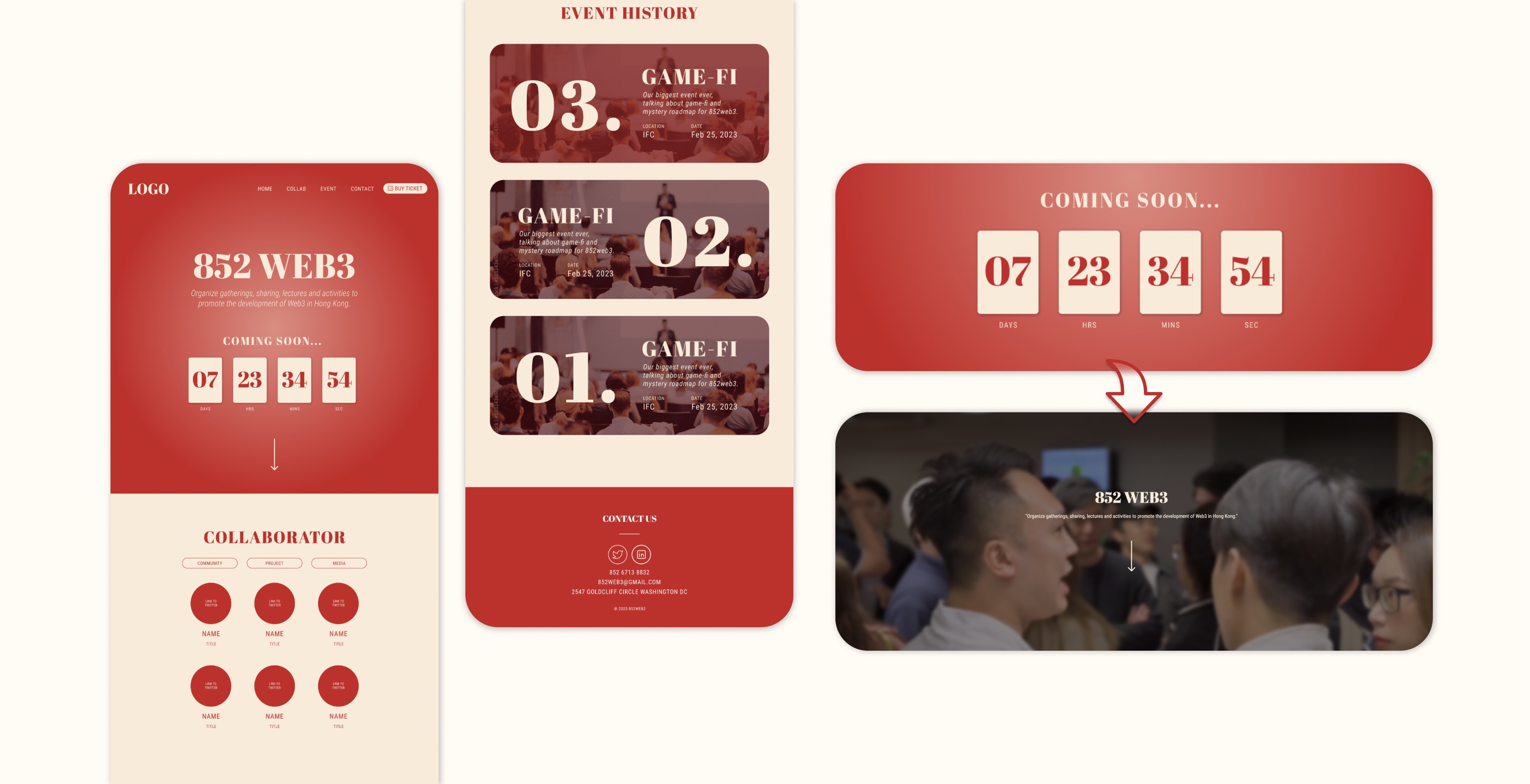
We found that event history should be more prioritized since users focused on our past event record instead of what collaborators we have. Thus, We move up the event history section.
We found that event history should be more prioritized since users focused on our past event record instead of what collaborators we have. Thus, We move up the event history section.
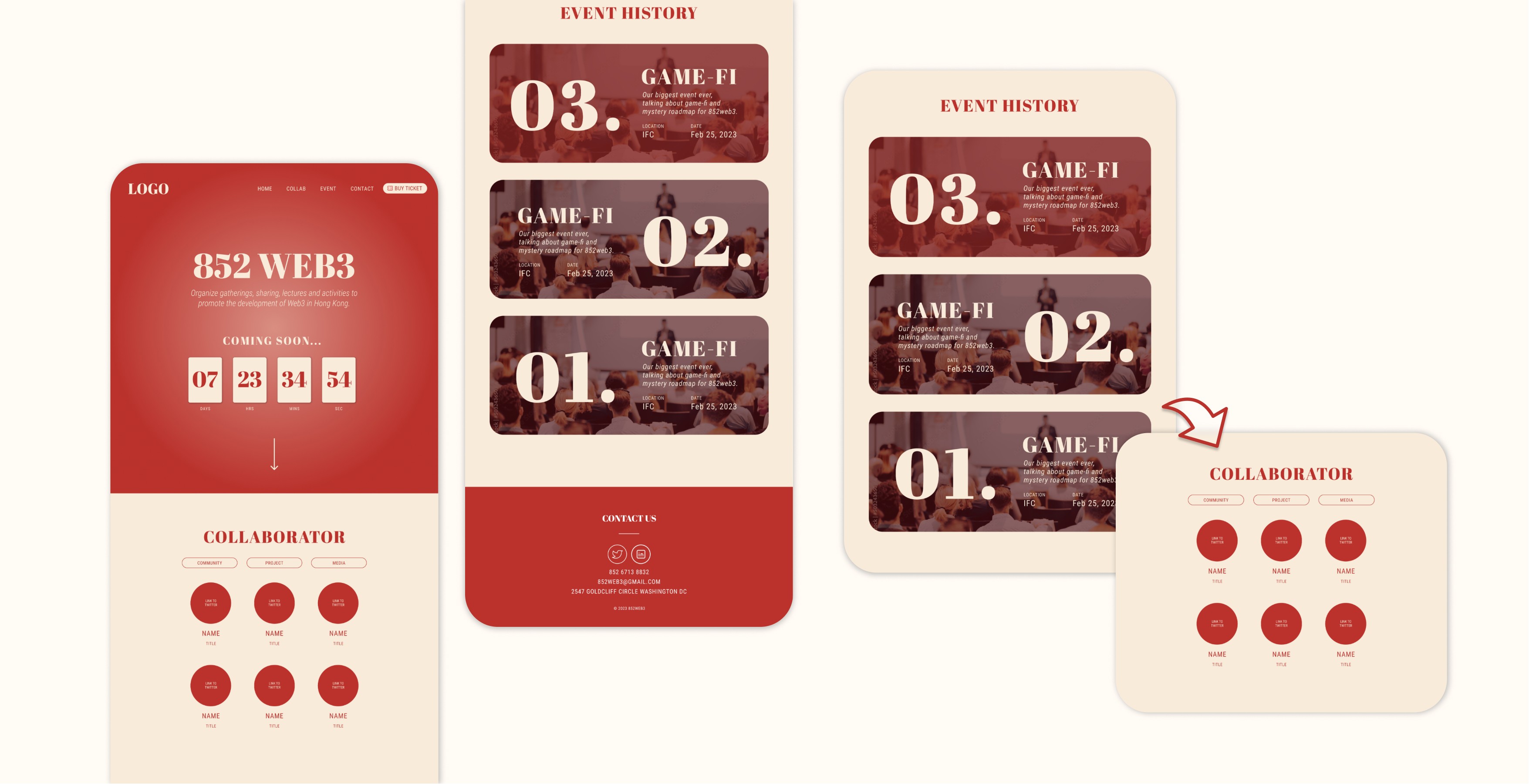


The countdown timer is not useful in reminding our participants and thus, we have removed it and added the video banner.
The countdown timer is not useful in reminding our participants and thus, we have removed it and added the video banner.
Since our event holds monthly or bi-monthly, there is a big time gap and it can’t provide the alert function. Besides, the hero section is not strong enough to drive visitor attention and video or animation can catch attention faster.
Since our event holds monthly or bi-monthly, there is a big time gap and it can’t provide the alert function. Besides, the hero section is not strong enough to drive visitor attention and video or animation can catch attention faster.


(final)
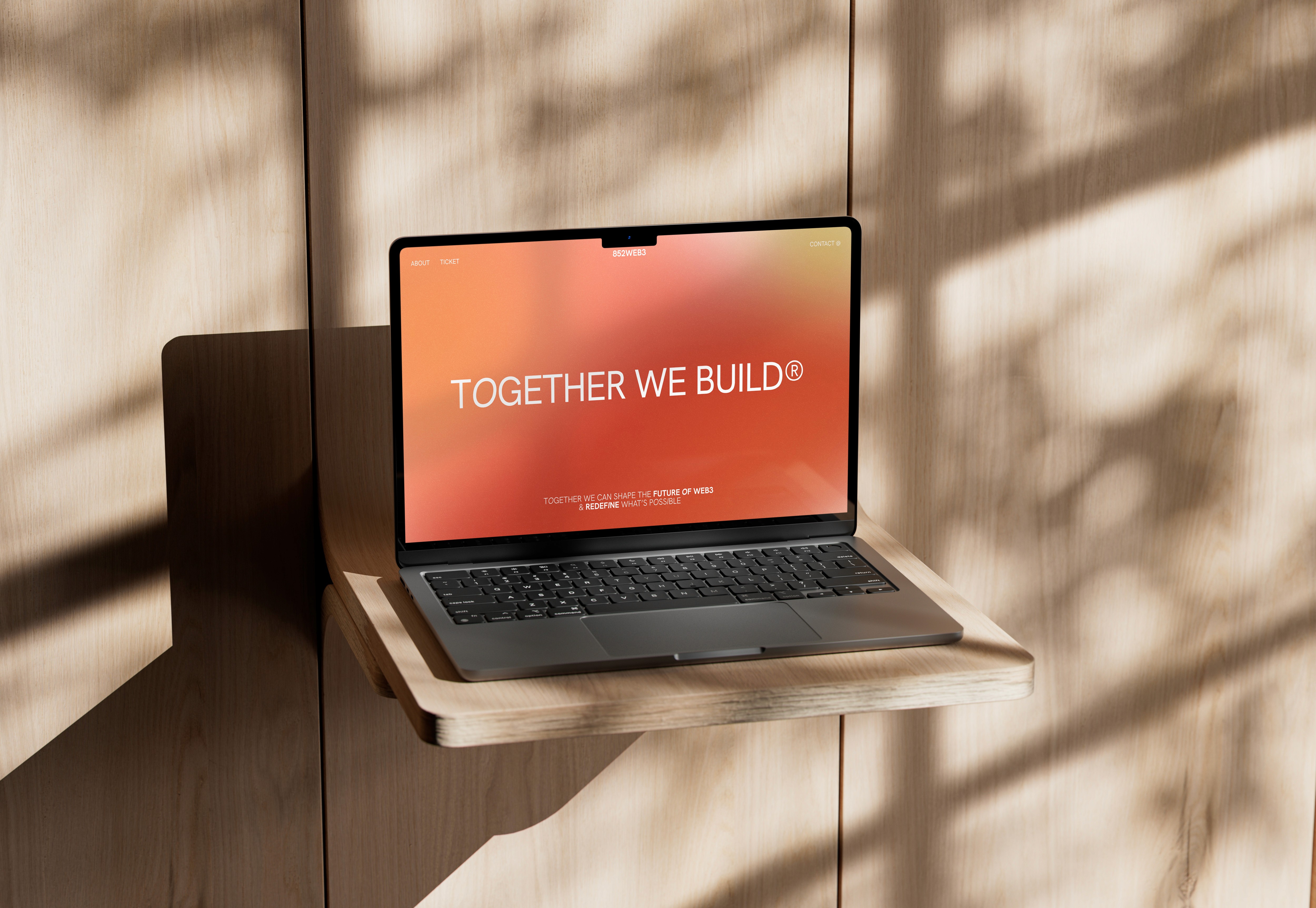
Here comes to the final design after testing.
Here comes to the final design after testing.
Stage Two
june 2023
june 2023
(goal)
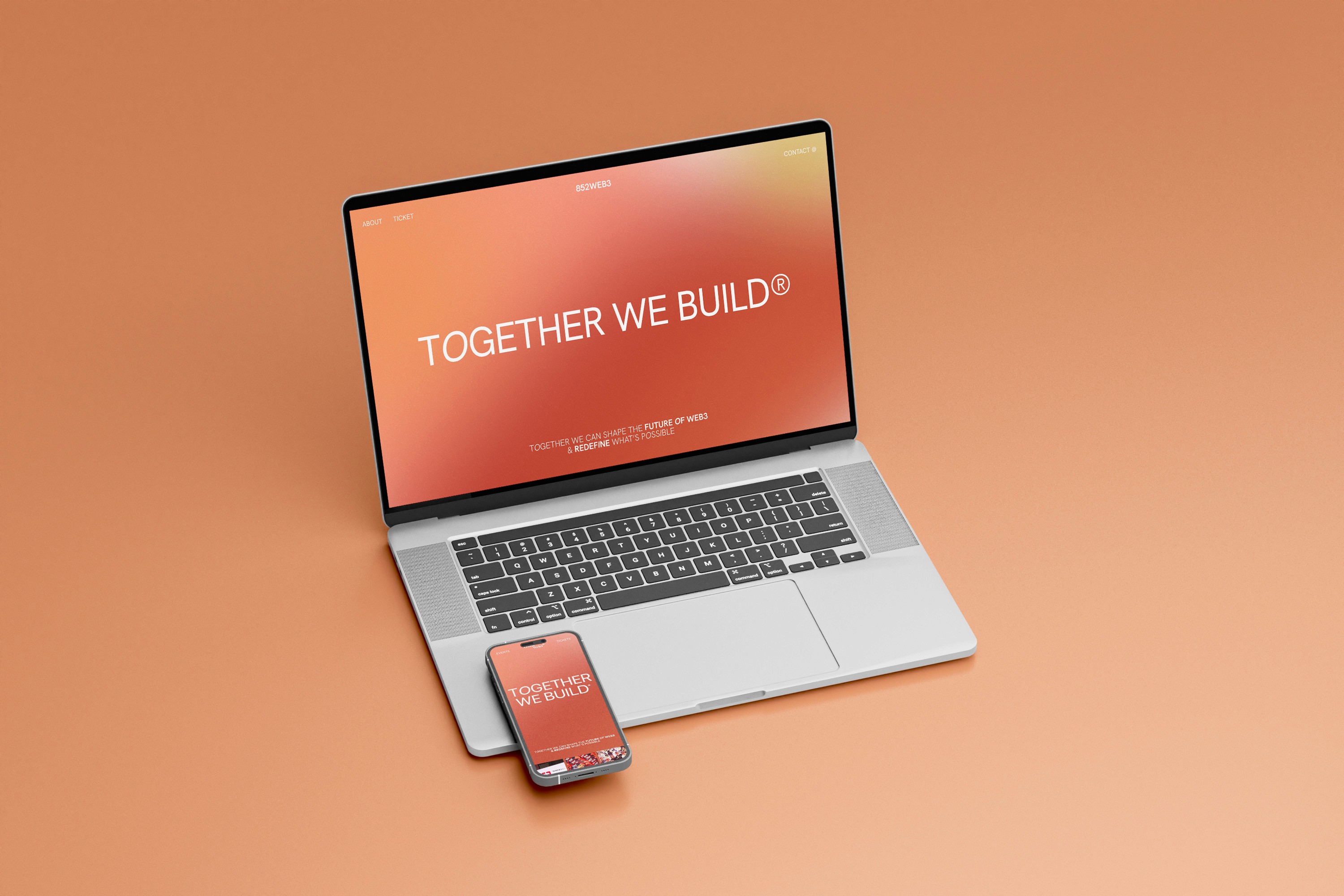
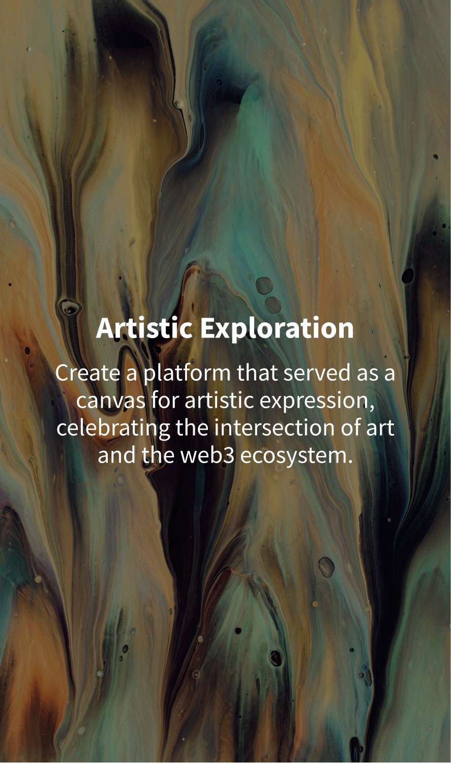
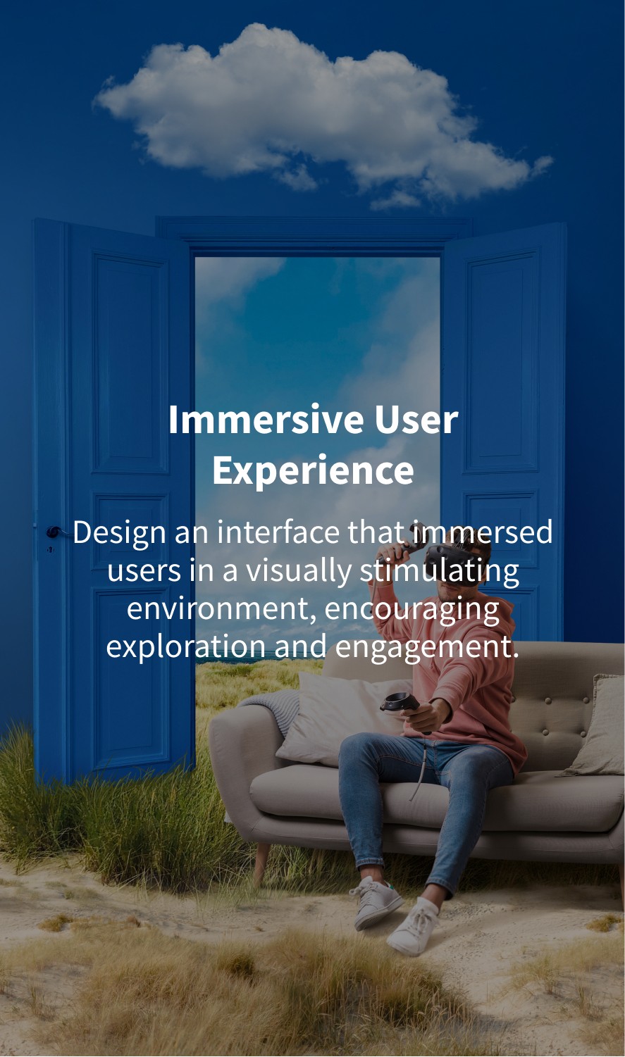
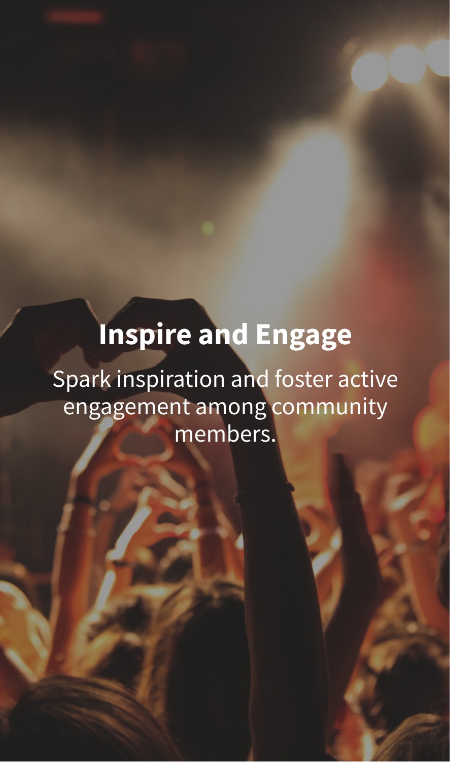
After running for few months, we want to rebrand the community into a more artistic style.
After running for few months, we want to rebrand the community into a more artistic style.






(design process)
(design process)
We then head to redesign the website UI.
We then head to redesign the website UI.
Since the site map will be the same as the first launch, we directly jump to the wireframe. Landing page will be the main focus in Stage Two.
Since the site map will be the same as the first launch, we directly jump to the wireframe. Landing page will be the main focus in Stage Two.
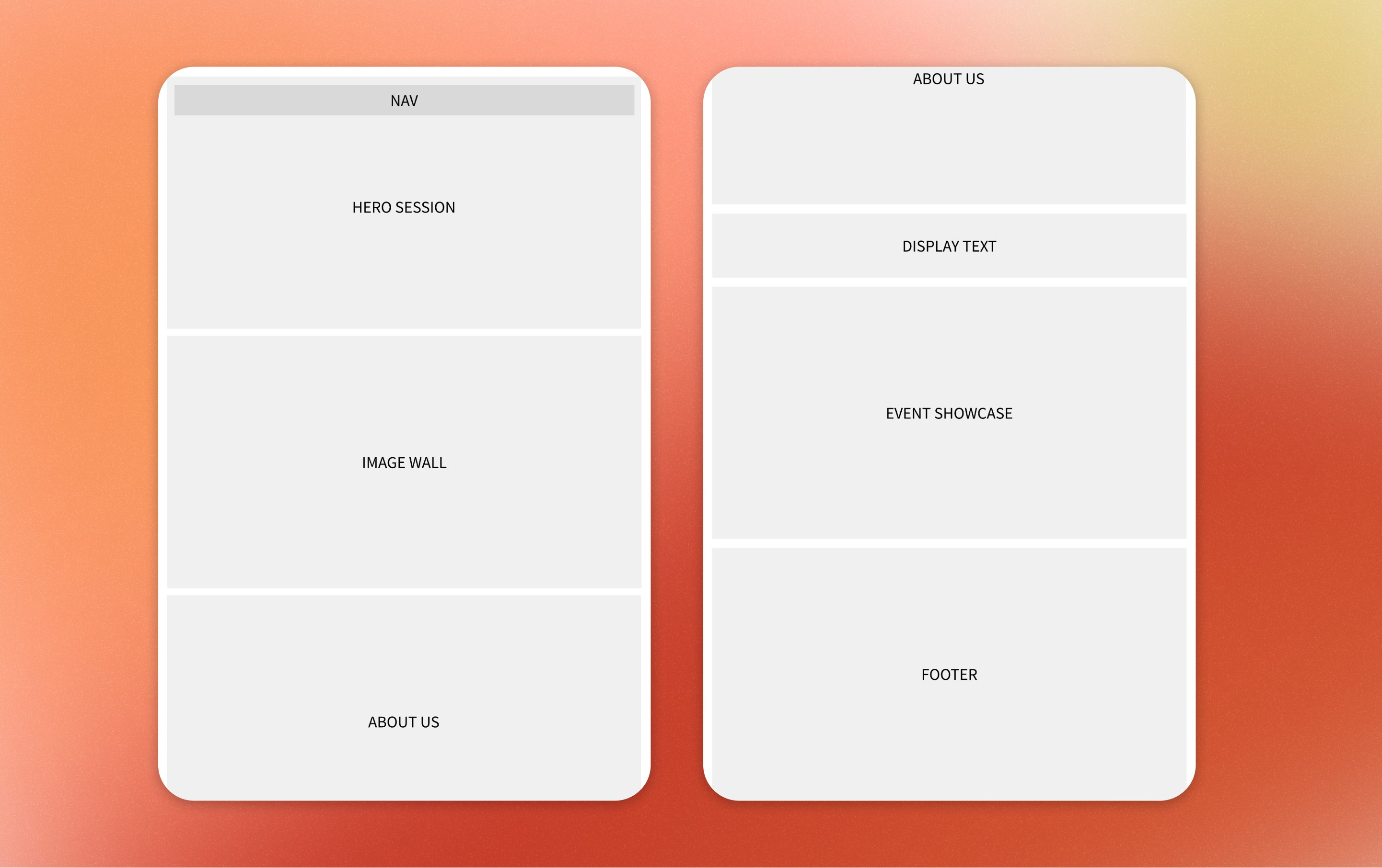


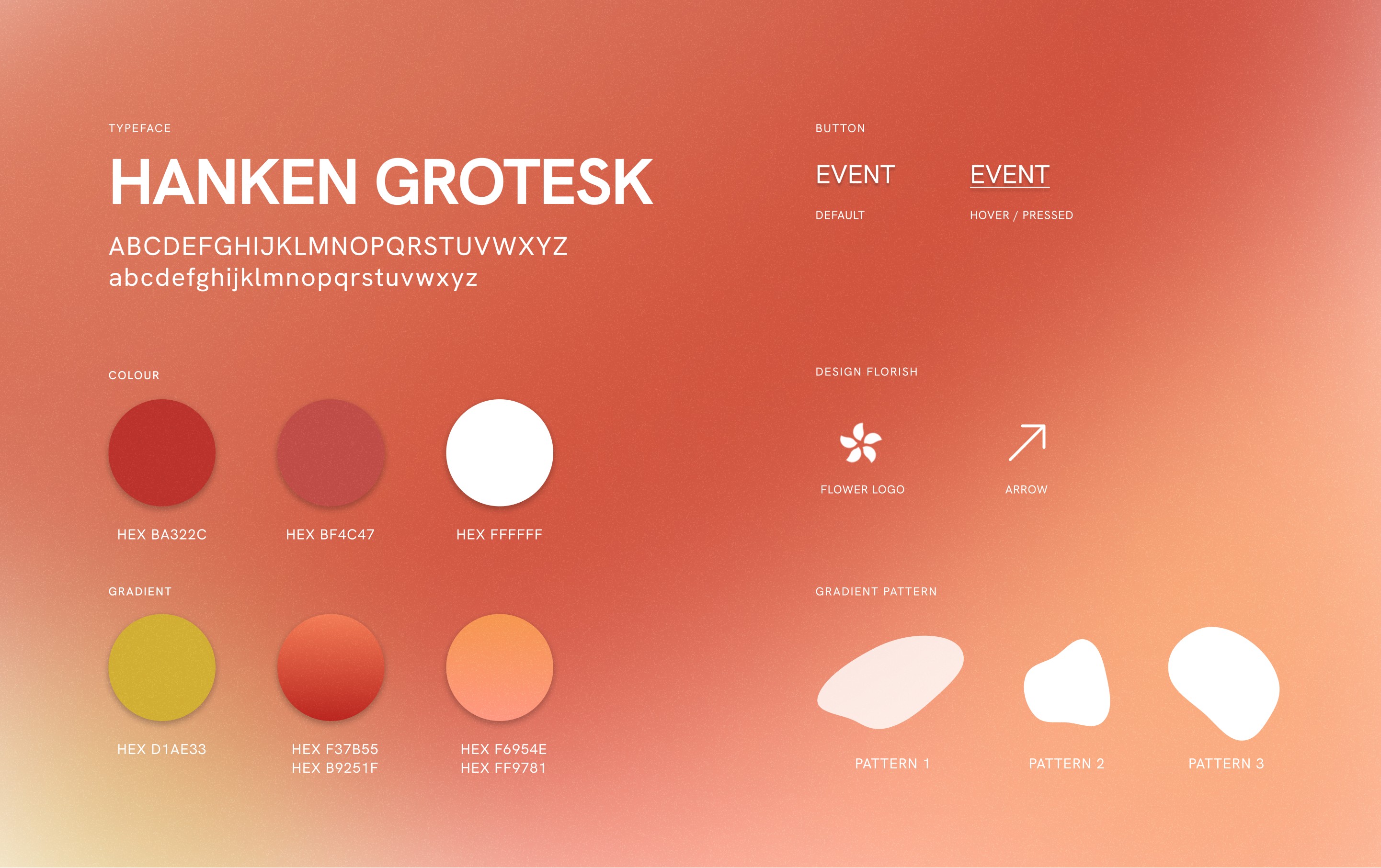
We turns these early wireframes into a high fidelity design and map out the new design system.
We turns these early wireframes into a high fidelity design and map out the new design system.
We have tested and experienced with different colour and font, and also the shape and the entire layout.
We have tested and experienced with different colour and font, and also the shape and the entire layout.




(result)
(result)
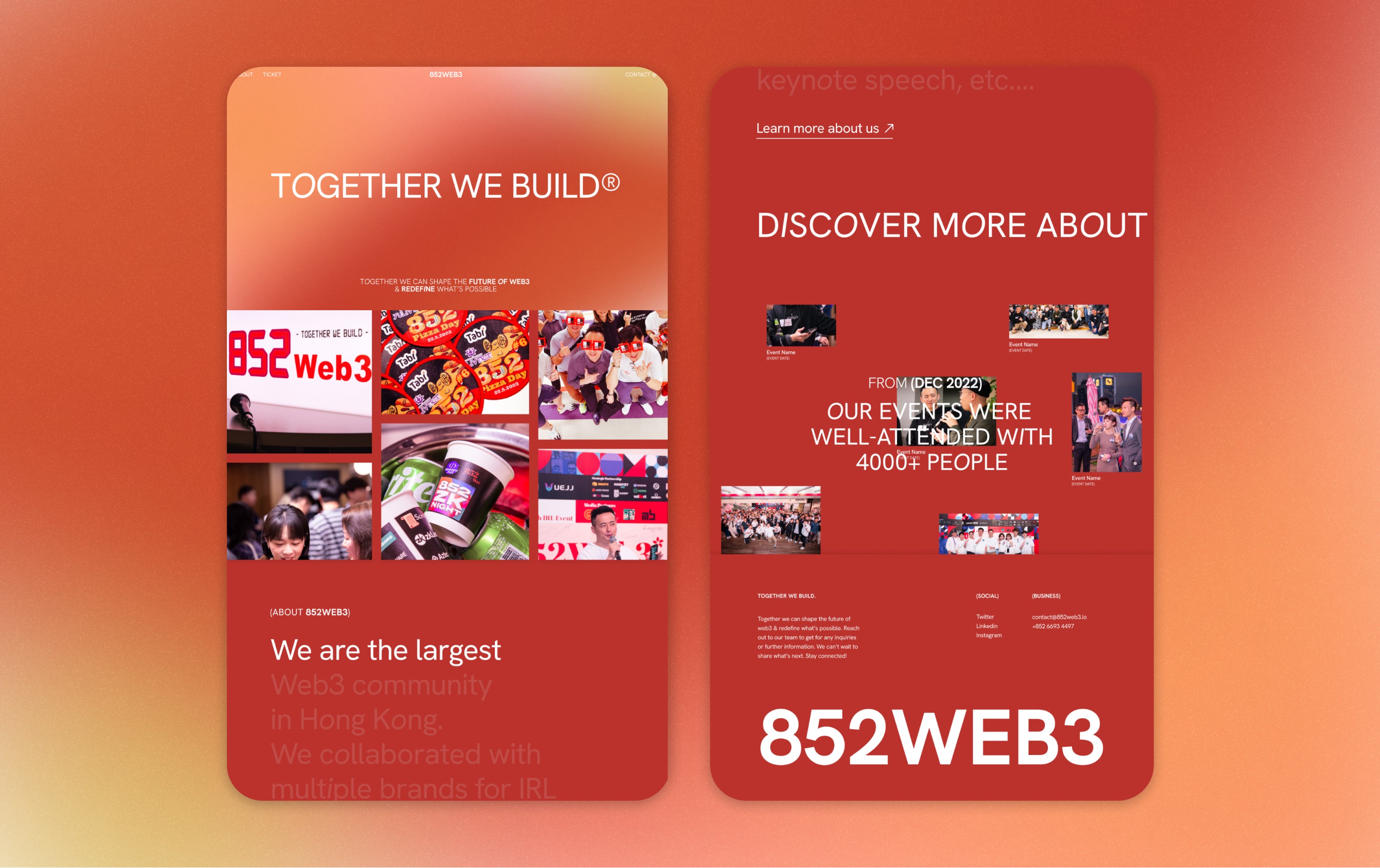
Here comes to the final design
Here comes to the final design
(impact)
(impact)
The website successfully encourage user to buy ticket through our ticket page.
The website successfully encourage user to buy ticket through our ticket page.
It has driven more traffic and more people have engaged in our event. The revamp website has been launched recently and we hope this revamp can bring more business opportunities.
It has driven more traffic and more people have engaged in our event. The revamp website has been launched recently and we hope this revamp can bring more business opportunities.
